Explore the full case study ↓
Syncing with the world-moving storyscapes of Istorima
Digital podcast platform sharing unique stories through the lens of the human experience. In quest of preserving the human voice of History, Istorima envisions a world where people’s stories travel across times and places to help us discover diverse perspectives and ultimately shape a better understanding of ourselves and our world. Recording and archiving oral stories around Greece since 2019, Istorima introduced in 2024 a new platform of curated podcasts, collections, and special features. The organization’s goal is to sync a vivid soundscape of our cultural heritage and share extraordinary stories as they were experienced.
Amplifying the human voice of History
The Idea
Perspective. Understanding. History. The three main axes of Istorima’s positioning brought forward the essence of a visual language that could convey the impactful and timeless connection between storytelling, listening and understanding.
Since childhood, we listen to stories. Through stories, we learn, grow and connect.
But no story grows in us like a real story does; like a story that shares one’s truth. This is the kind of stories we can truly relate and connect with, meeting ourselves in the details and others in retrospect.
Istorima collects exactly such stories, narrated by the people who lived them and presented through the lens of their own experience.
Our solution for the brand’s identity was founded on a pivotal blend of three domains; sound, geometry and cinema.
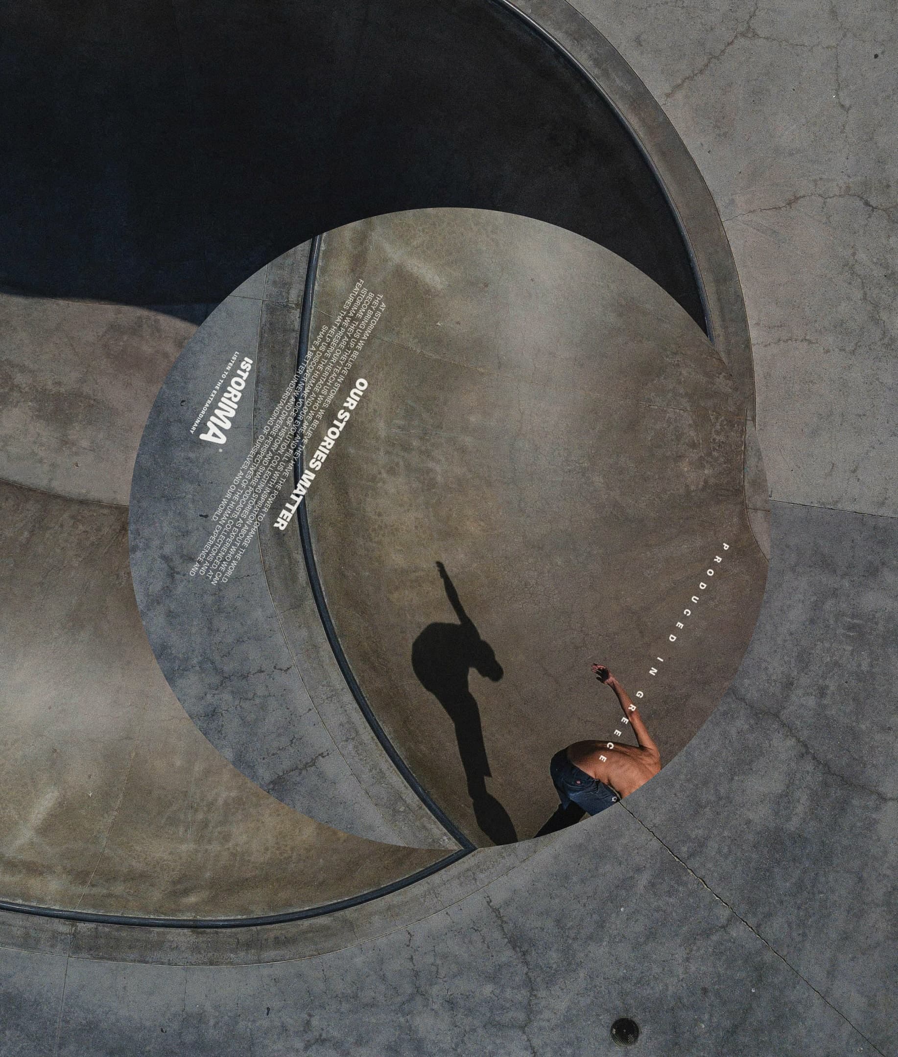
Digging into the sound realm, we met again with vinyl disc formats and used common layout principles to call on analog sound recording methods and communicate Istorima’s quest to record the voice of our history. At that point, the intense presence of the circular element in sound storage formats defined the circle as one of the identity’s main shapes, depicting the rounded - as in holistic - understanding of the world that stories give us. In parallel, from the start of our assignment, we were strongly attracted to Istorima’s cinematic essence, as both storytelling and cinema shift our focus from who we are to who we can become when we connect with others’ perspectives and experiences.
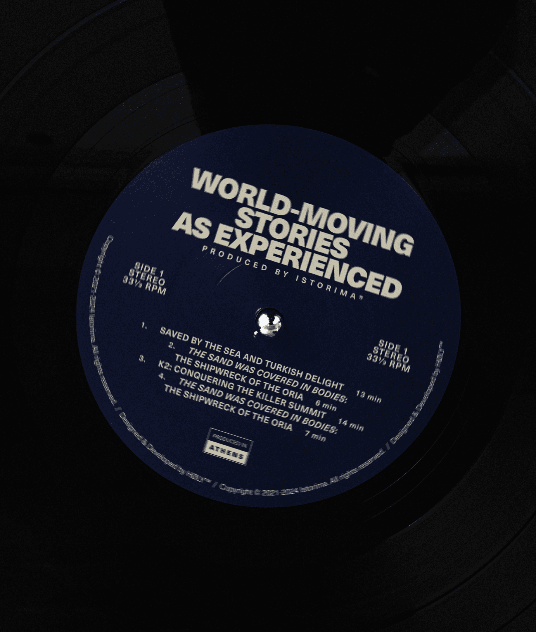
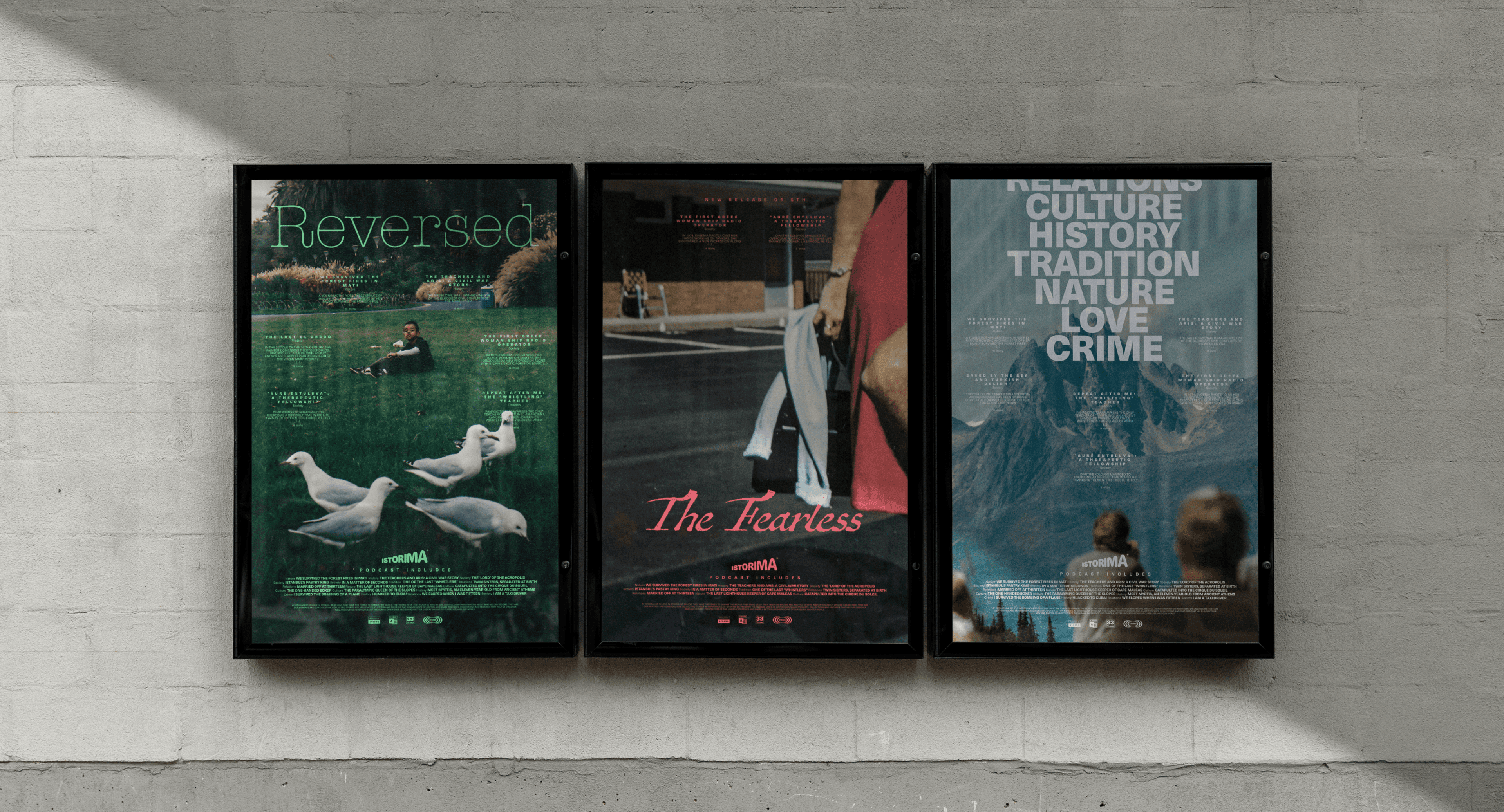
Thus, for the most part, Istorima’s identity bridges distinctive qualities from the worlds of sound and cinema using layout principles that revisit both. Diving into this dynamic fusion, and exploring the different visual languages that developed through decades, we found movie posters and vinyl records. On the one hand, movie posters’ format principles intensify the dramatic character of each story, while vinyl records’ format serves as a reference to Istorima’s mission to bring us closer through listening to each other’s side.
Logotype Design
Istorima’s logotype is designed to inspire dynamism and disruptiveness, aligning with the brand’s vision to redefine the way we connect both to our history and each other.
The idea combines a series of elements and notions that are key to Istorima’s vision and positioning. Primarily, it features the rising volume’s form to represent Istorima’s empowering role in sharing people’s oral stories. At the same time, the logotype’s angle gives a sense of perspective, aligning with Istorima’s promise of sharing stories to offer a new perspective of how we see the world and what we know about it.
The logotype’s animated version is characterized by an internal contrast - a discreet weight change, caused by the composition’s movement towards the left, while seemingly opposing the wordmark’s expansion towards the right. Despite their opposite directions, those two forces ensure balance, in the same way that sharing different perspectives can ensure understanding, resolution and harmony.
For a moment, every letter gets a central position, capturing the viewer’s attention and then gradually becoming part of a waveform that composes the logotype. This sequence converses with the way each story at Istorima comes at the epicenter of our listening experience, creates tension through its impact on our sentiment and knowledge and, in the right composition with all the other stories, broadens our understanding of how common things are experienced differently and contribute to the harmony we can achieve when we listen to each other.
I would like to congratulate the entire team for the exceptional result. In both design and brand language, you have perfectly captured the character, freshness, vitality, and vision for our project’s future.
Brand Assets
Another major and notably interesting part of our collaboration with Istorima was related to the creation of the brand’s tagline and a comprehensive language system, setting the principles and rules for effective, direct, and engaging communication according to the brand’s objectives. Aspiring to create a mood-setting tone of voice that moves our emotions and intrigues our curiosity, Istorima’s verbal identity comprised a fully developed narrative and a series of key messages and presentation texts serving several communication purposes according to the team’s needs.
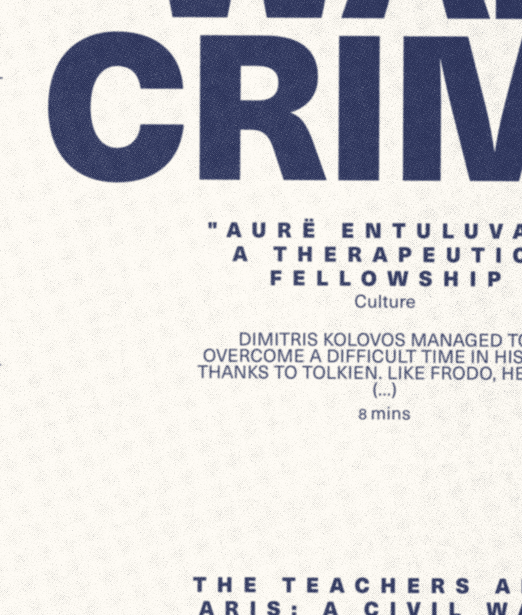
With the brand’s messaging at hand, our selection for Istorima’s main brand typeface was driven by the need to communicate the intense and immersive character of the platform’s content. Thus, we went for Helvetica Neue, a clean, straightforward and highly legible typeface, that allows strong and direct messaging, while being functional for use in titles and more extended paragraph texts on both print assets and web interfaces. Moreover, the titles’ layout draws upon the central alignment of movie credits and quote extracts, adding an extra distinctive asset to Istorima’s typographic language and achieving consistency with the cinematic concept that crosses Istorima’s identity.
At the same time, to present and highlight the variety of subjects and theme categories that Istorima’s stories cover, we chose 8 different complimentary display typefaces, one for each category, depending on the theme and the general feeling of the stories included.
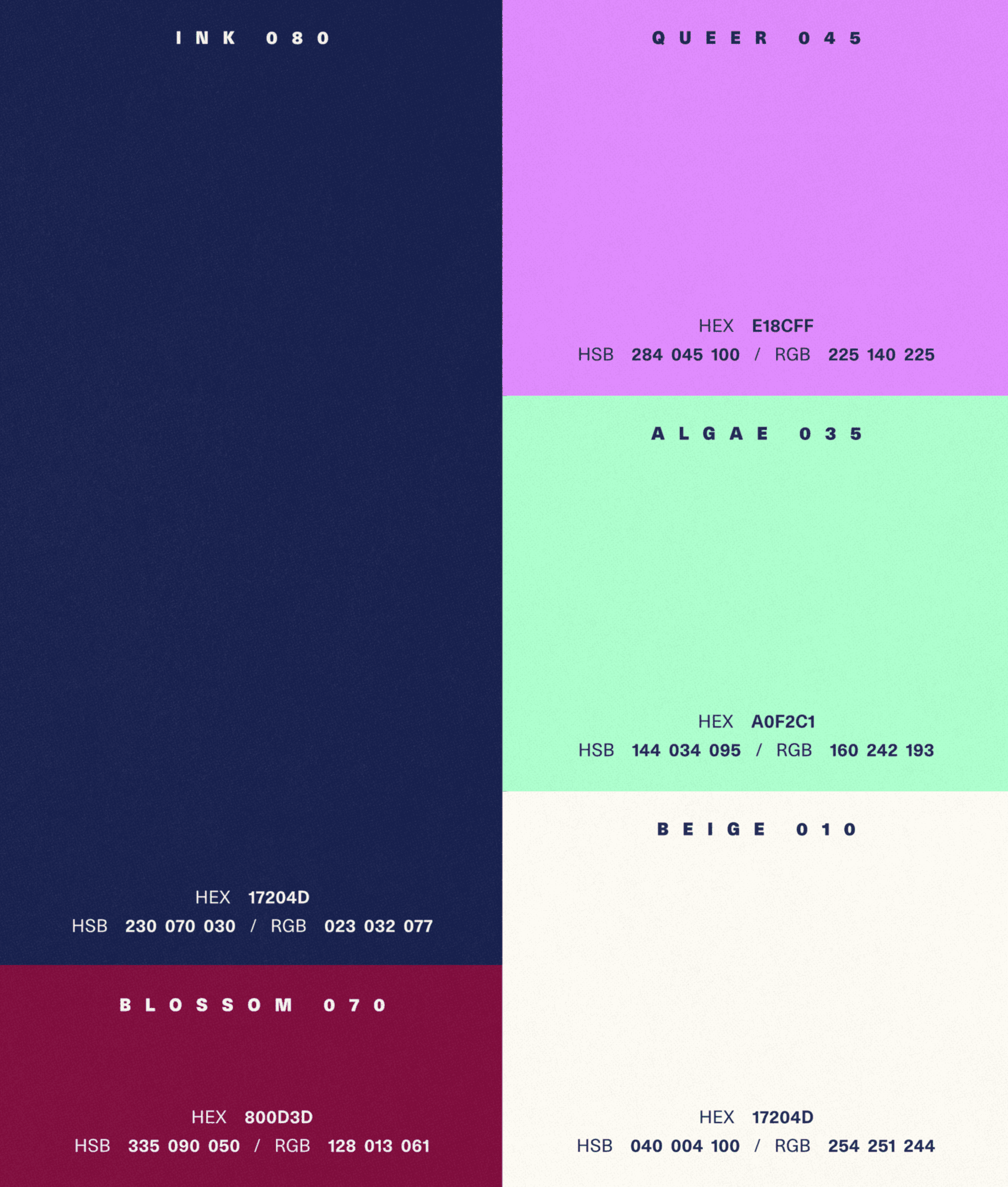
For the brand’s color identity, we composed a vibrant palette of darker, neutral and fluorescent tones, yet the way we systemized it aimed to create high contrast and reflect the stories’ disruptive character, but also ensure balance with the brand’s mature, responsible and professional personality.
Brand Applications
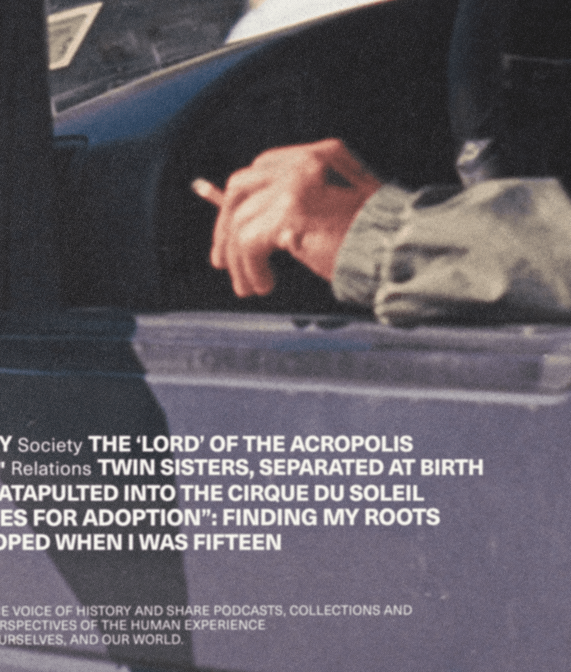
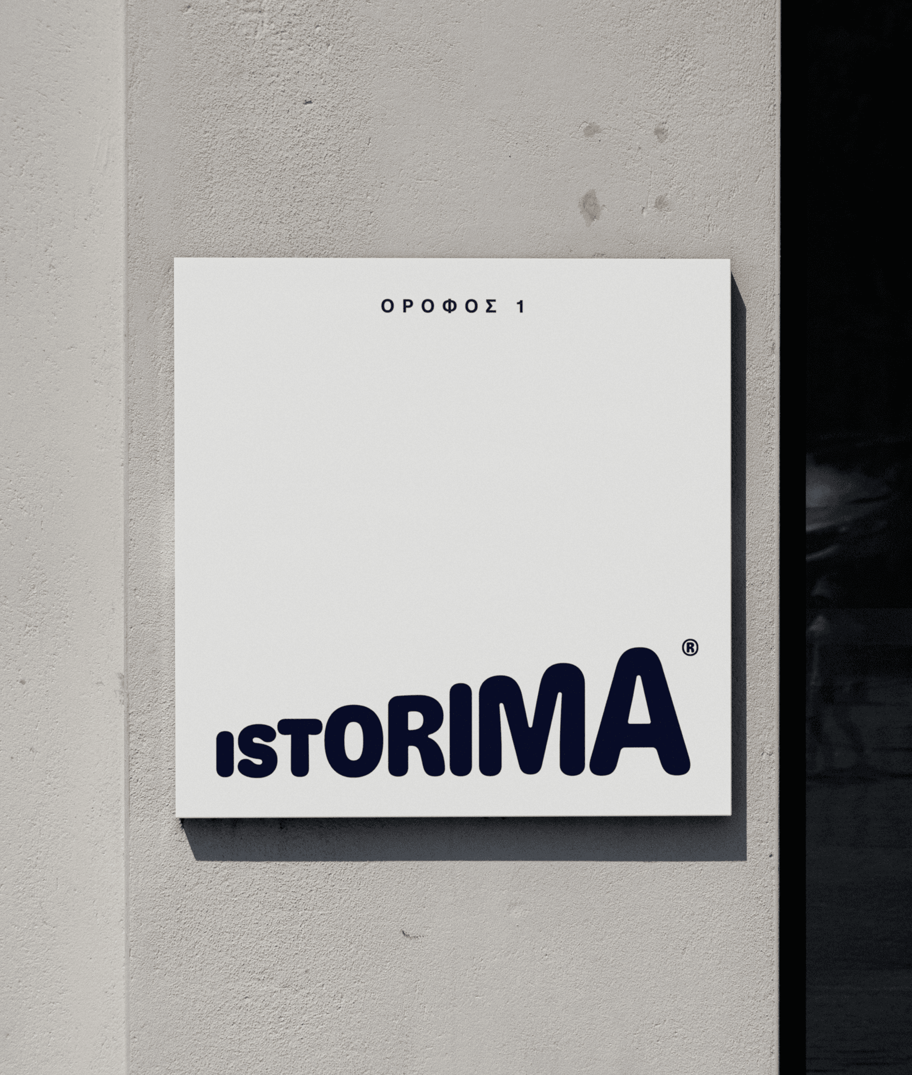
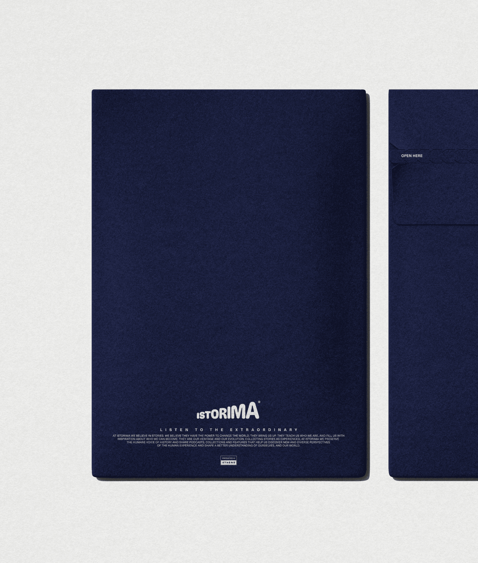
Istorima’s mission is to collect unique stories revealing something extraordinary about who we are and who we can be, and share them to reveal new perspectives of the human experience. This extrovert character of Istorima was elevated and promoted further through a series of merchandise materials, from office interior posters, tote bags and t-shirts to social media post templates and podcast platforms’ covers.
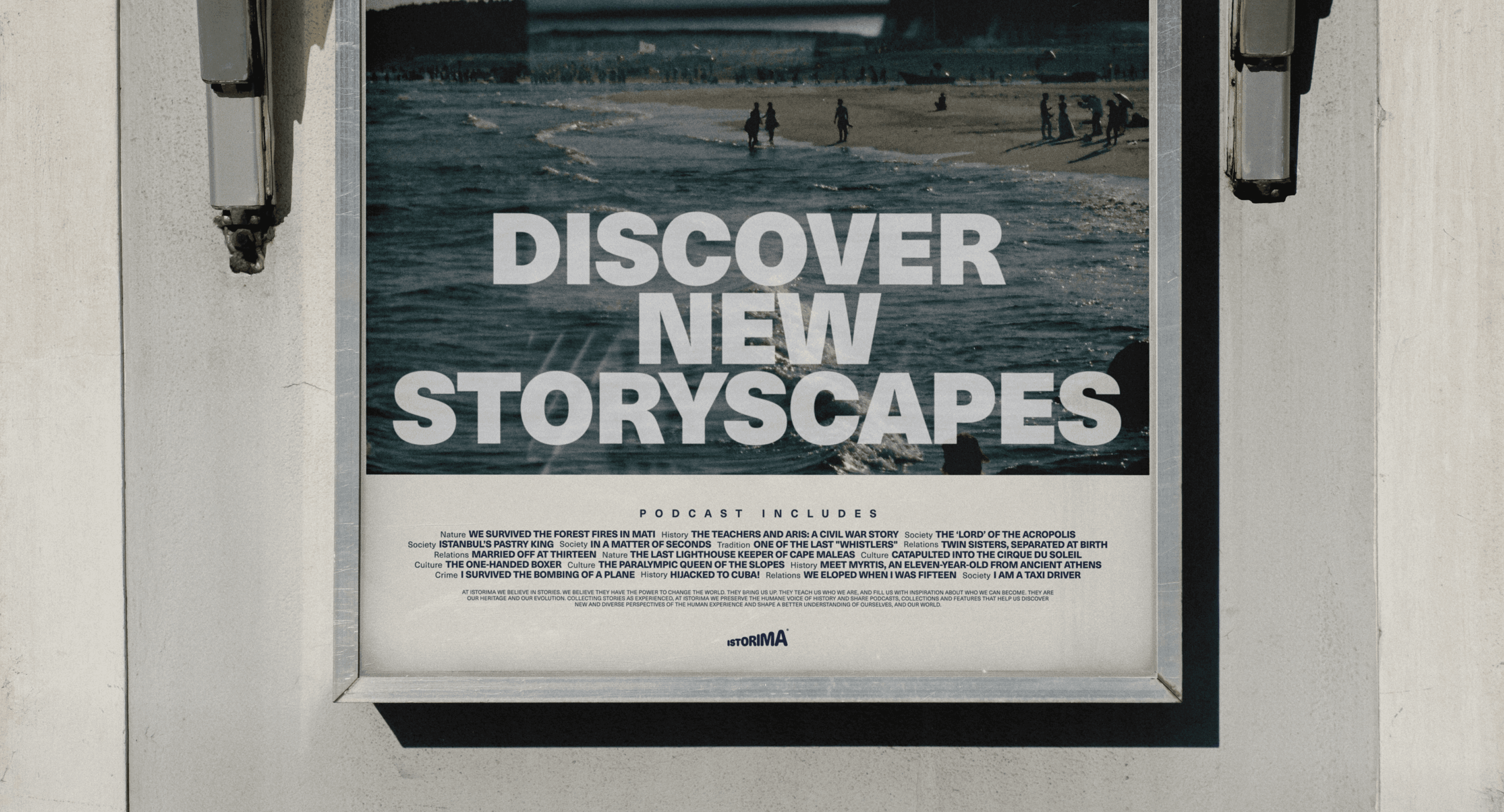
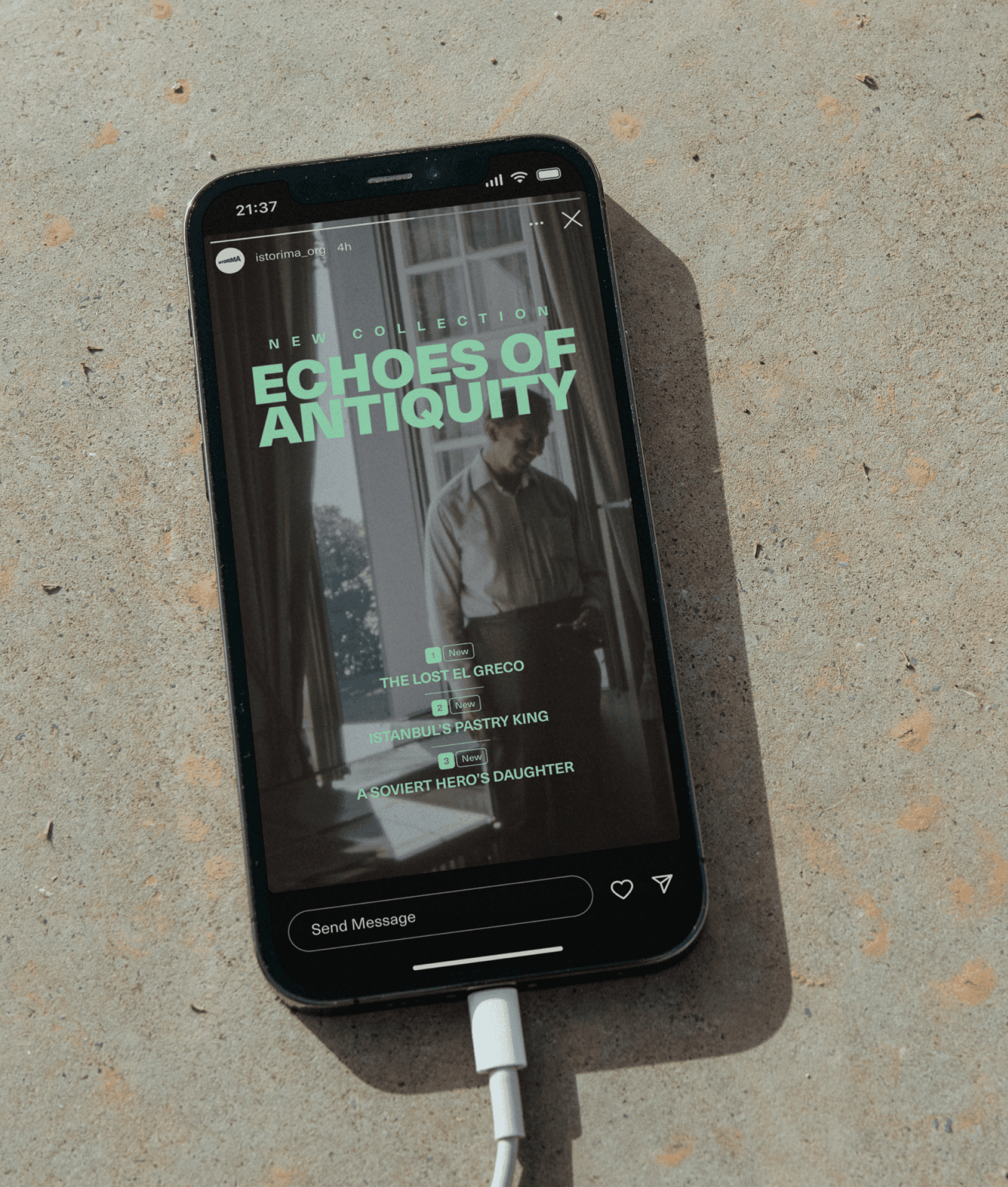
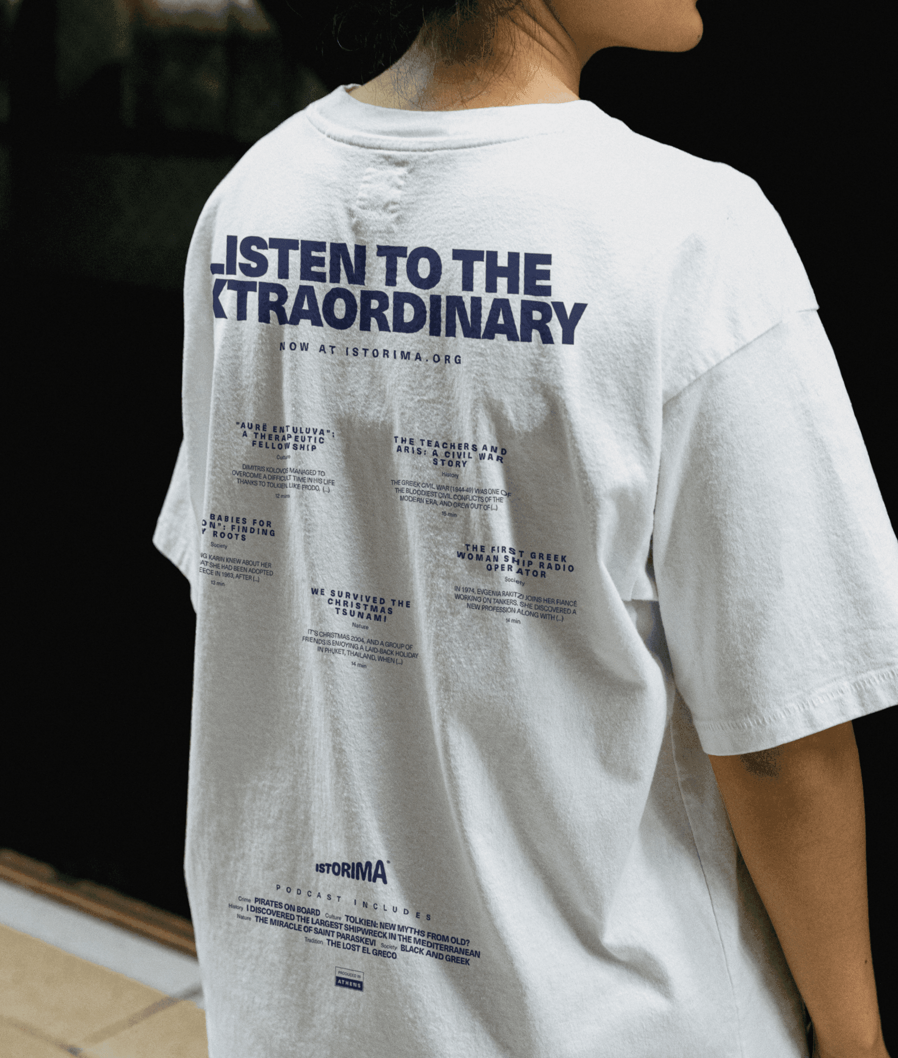
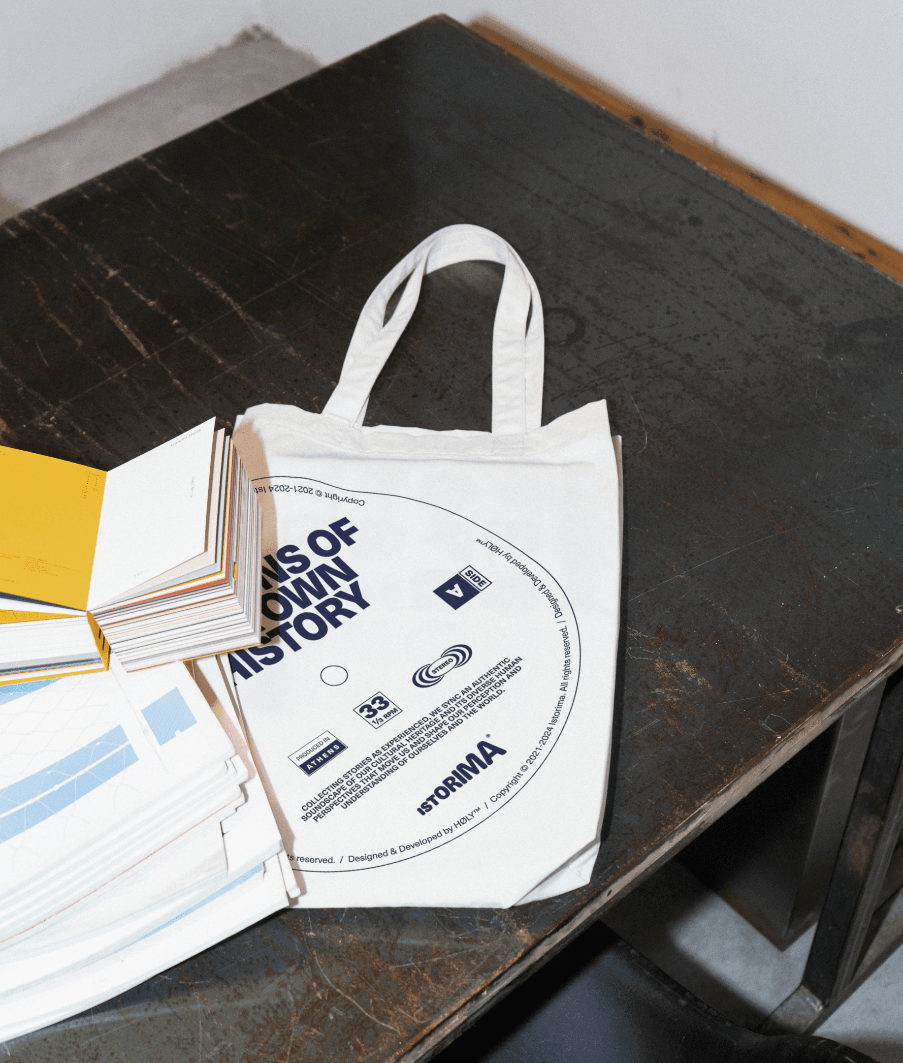
In close collaboration with the Istorima team, we crafted a diverse yet systemized presence that supports Istorima’s introduction to the audiences and preserves its core identity elements on every occasion.
Platform UI/UX Design
The background of our collaboration with Istorima circles around the creation of their digital archive, the first platform they created to host the oral stories collected and transcripted by field reporters all around Greece. Luckily, besides the rebranding, our collaboration expanded to the UI/UX design and development of its brand new platform, introducing a new digital experience for listeners in search of real, world-moving, human stories.
Read more about our process and the platform’s UI/UX design on the respective tab.