Explore the full case study ↓
Creating a world for moments worth sharing withPublic
Rebranding for one of the most established retail companies in Greece, including visual identity design, brand language, and extensive visual assets for scale-agnostic brand applications, so as to ensure a consistent and engaging character across in-store and digital touchpoints with customers.
A brand devoted to spreading warmth and joy
Brand Concept
Our assignment for Public involved the creation of a comprehensive, flexible and consistent identity, able to cover the different product categories and ensure the brand’s character across touchpoints with customers.
The main concept embraces the joyful character of the Public brand, as one of the top destinations for entertainment and gifts in Greece and Cyprus, and celebrates its expansion to the worlds of technology and home appliances, highlighting our potential to enjoy life more. Public aspires to make this promise true by focusing on the freedom of choice among a great assortment of top-picked products and customer-centric services that make people’s lives happier and more carefree.
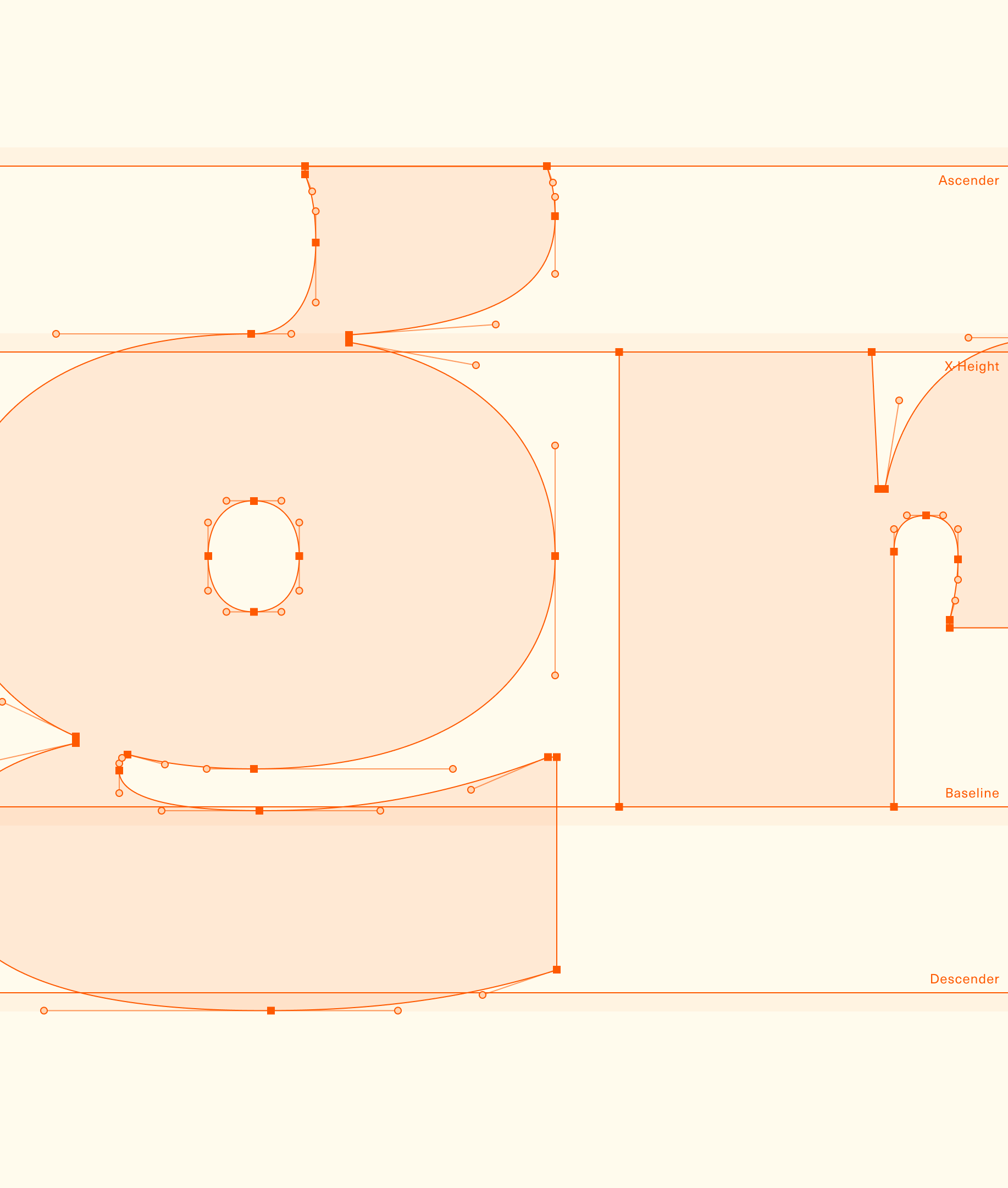
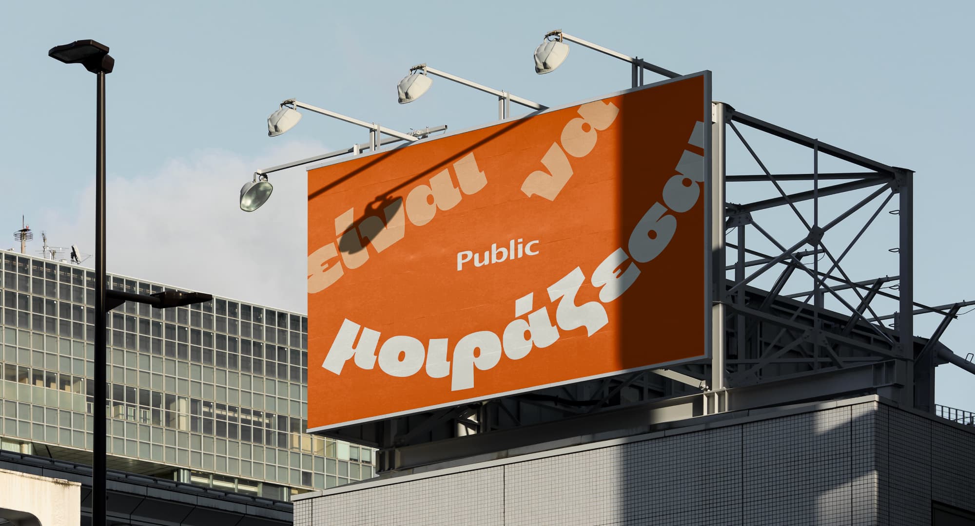
Custom Typeface | Huggable
Huggable is a custom display typeface designed as a core element of Public’s new visual identity. Our goal was to create a typeface that would reflect the brand’s feelgood character and literally make you want to hug and squeeze it. It’s principles are based on Public’s existing logotype, whose letters served as a foundation for developing a brand new typeface with a contemporary, happy, playful, sweet, and, most of all, huggable character.
Huggable offers two sets of Latin and Greek characters and is available in 5 weights to cover different communication needs and score smooth readability on every scale without losing its plethoric and joyful character.
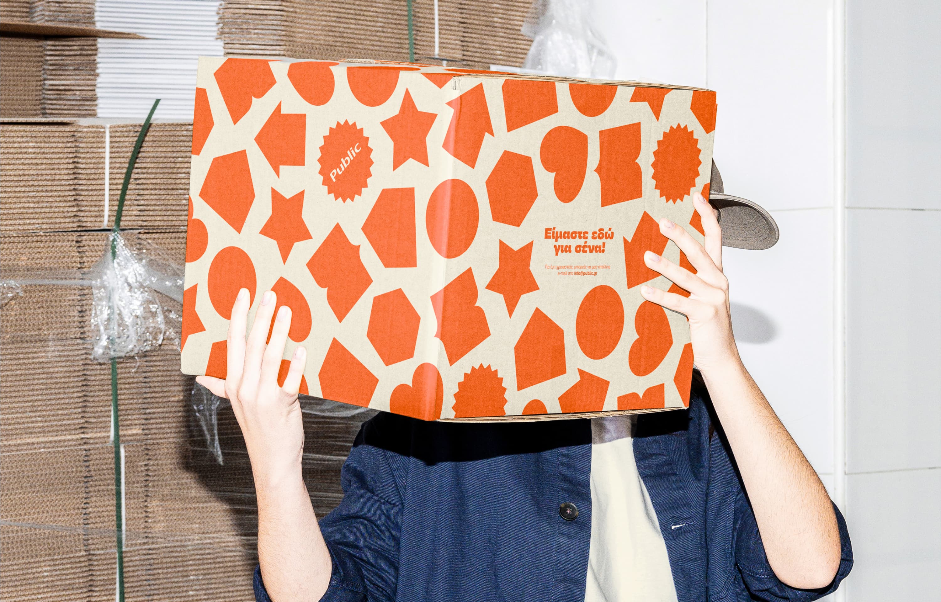
Pattern
Public’s new visual identity is defined by a distinctive pattern created from custom-created shapes to inspire playfulness, cuteness and ease in a free and approachable way. Their slight rotation gives their geometric simplicity a little twist, messing with clean layouts and compositions and setting the mood for expression and playtime.
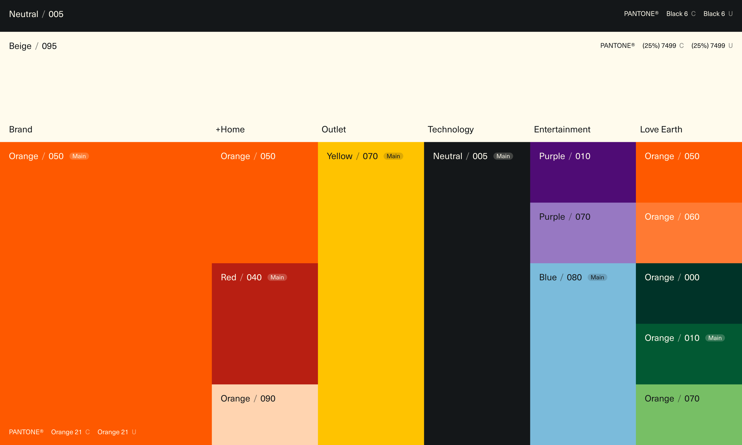
Color Palette
Orange has been Public’s legacy color for many years and thus entitled as the main brand color, inspiring warmth, energy and positivity.
However, the need to cover additional tactical communication needs for existing and new product categories led to the creation of a wide color palette of secondary brand colors, whose selected hues and tints are used in different physical and digital applications to ensure consistency and increase recognizability across touchpoints.

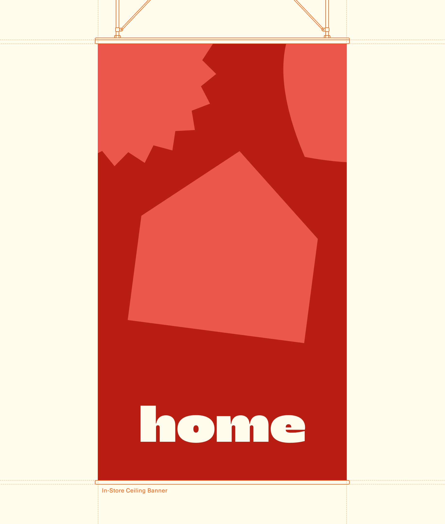
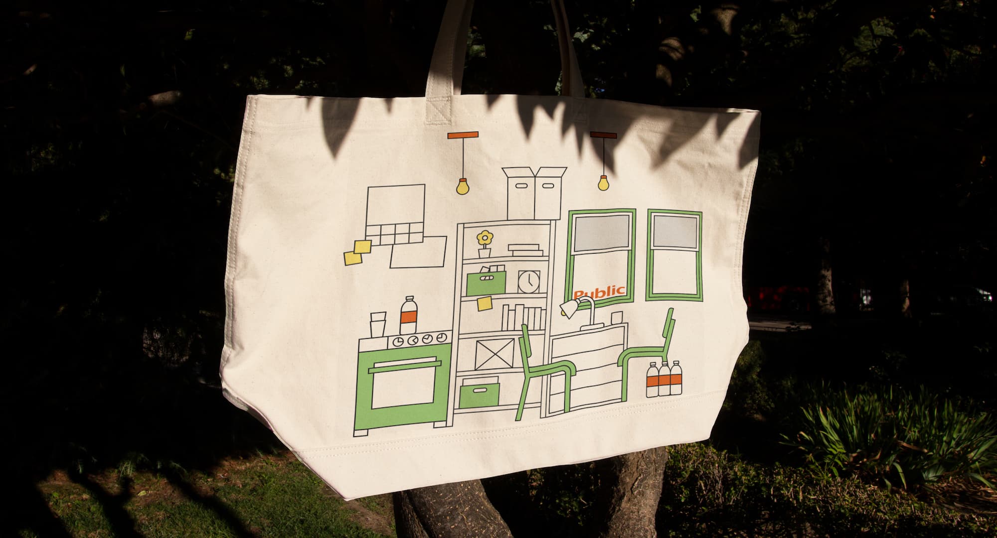
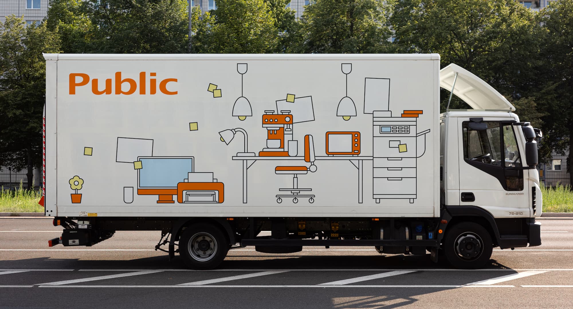
A wide and ever-expanding library of simple, friendly and custom-made illustrations creates everyday environments, worlds and stories that converse with the pattern’s and typography’s geometry to enliven Public compositions, by incorporating the hand-written element into the brand identity to inspire a more humane and natural character.
Merging two retail giants was one of the most critical challenges our team has taken over during the past years, demanding the collaboration of numerous partners and seamless integration of multiple processes. HØLY translated our aspiration of ensuring for our customers the best of both worlds, creating an inclusive communication strategy that speaks to people’s hearts and tickles their excitement for discovering and sharing more, together.
Typography and Iconography
For the brand’s base typography, we selected Neue Haas Unica, a classic, human-centric and versatile typeface. Its geometric principles and clean character served as a base for the creation of custom iconography, featuring the brand’s characteristic rotation twist, and covering all product sub-categories, while ensuring brand consistency and high functionality in both digital and physical applications.
3D Visual Language
The pattern’s shapes come to life through an extensive 3D visual language we developed, featuring different positions, textures and lighting angles to create a wide library of three-dimensional assets that can serve as distinctive elements on digital tactical communications while ensuring consistency with 2D applications in the physical world.


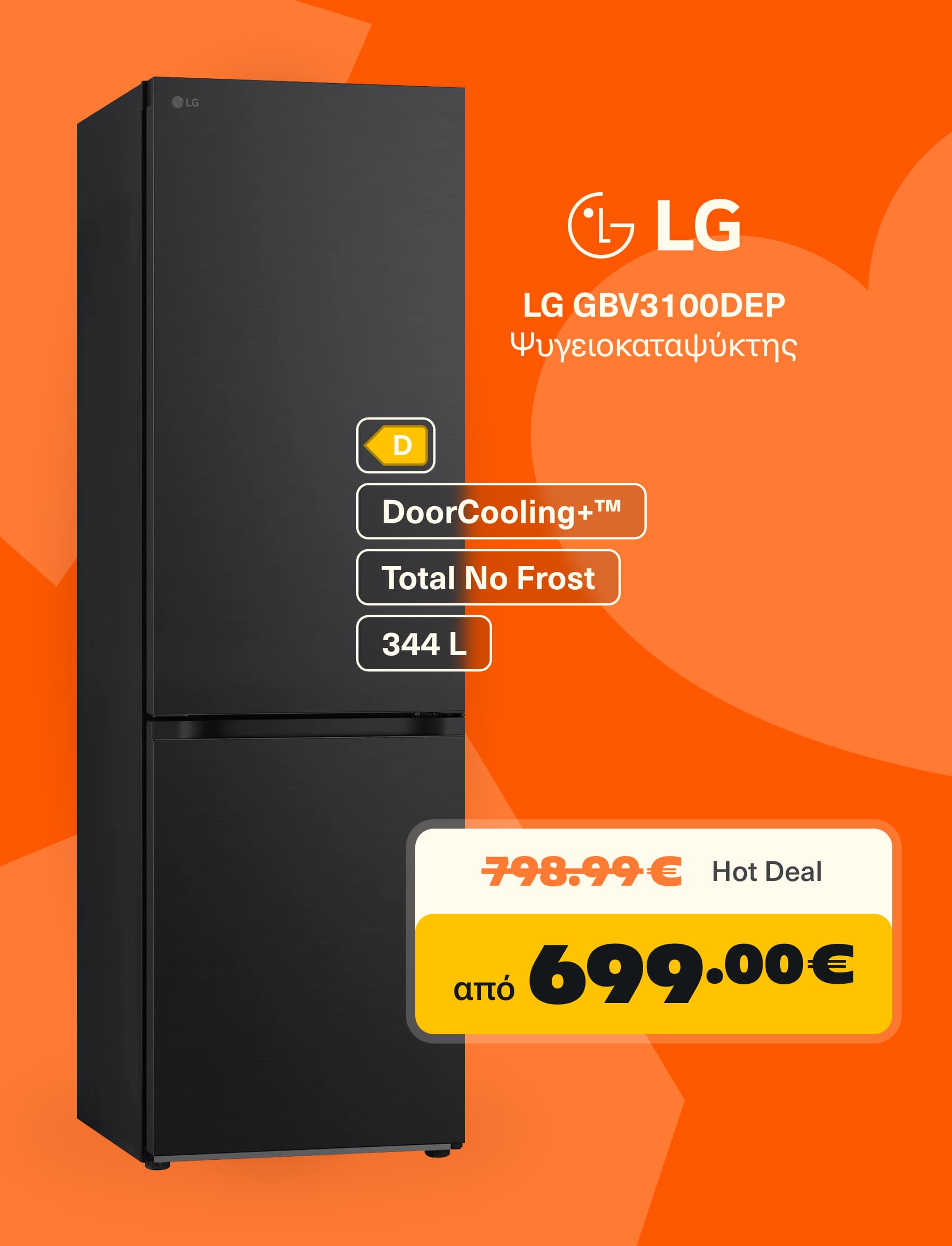
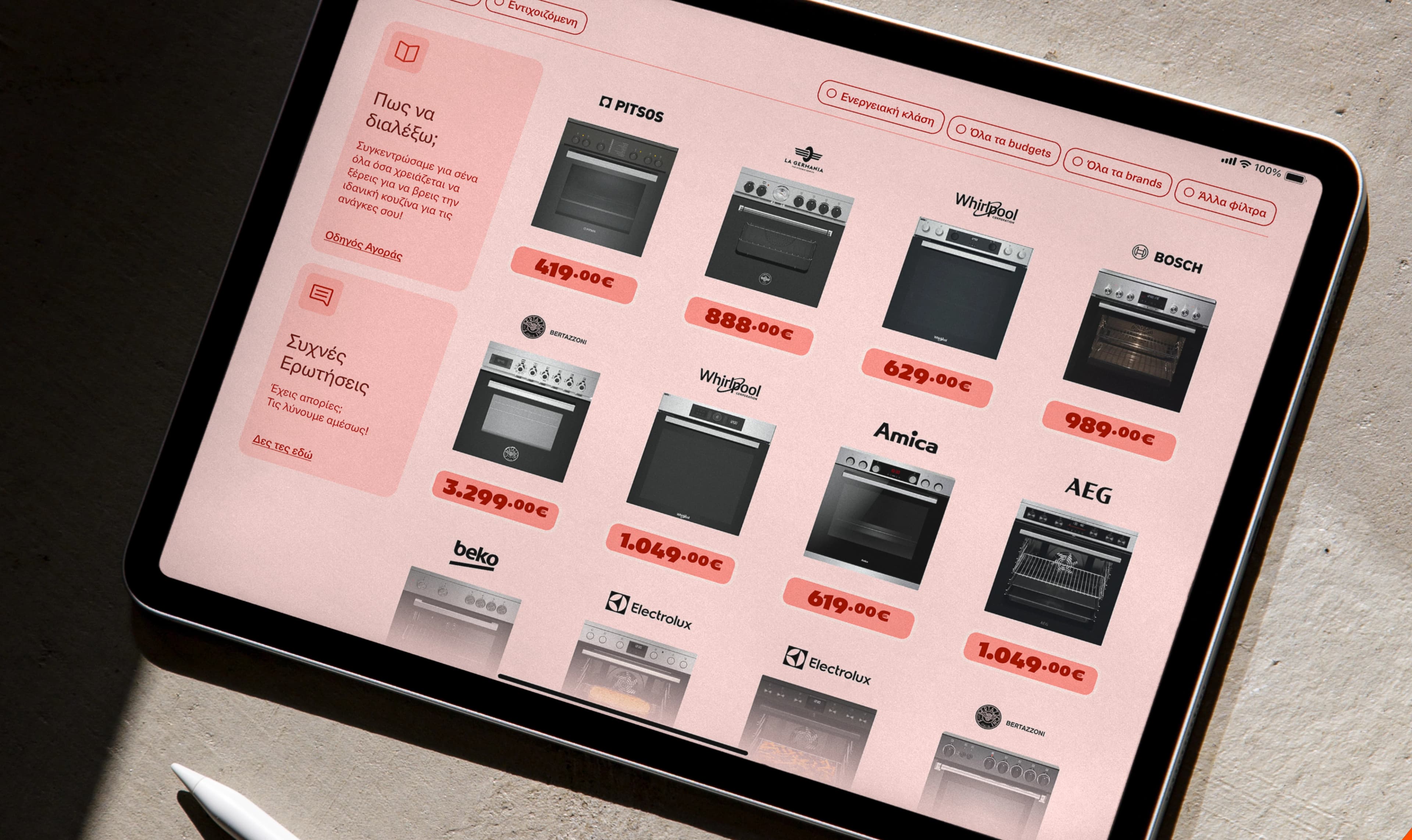
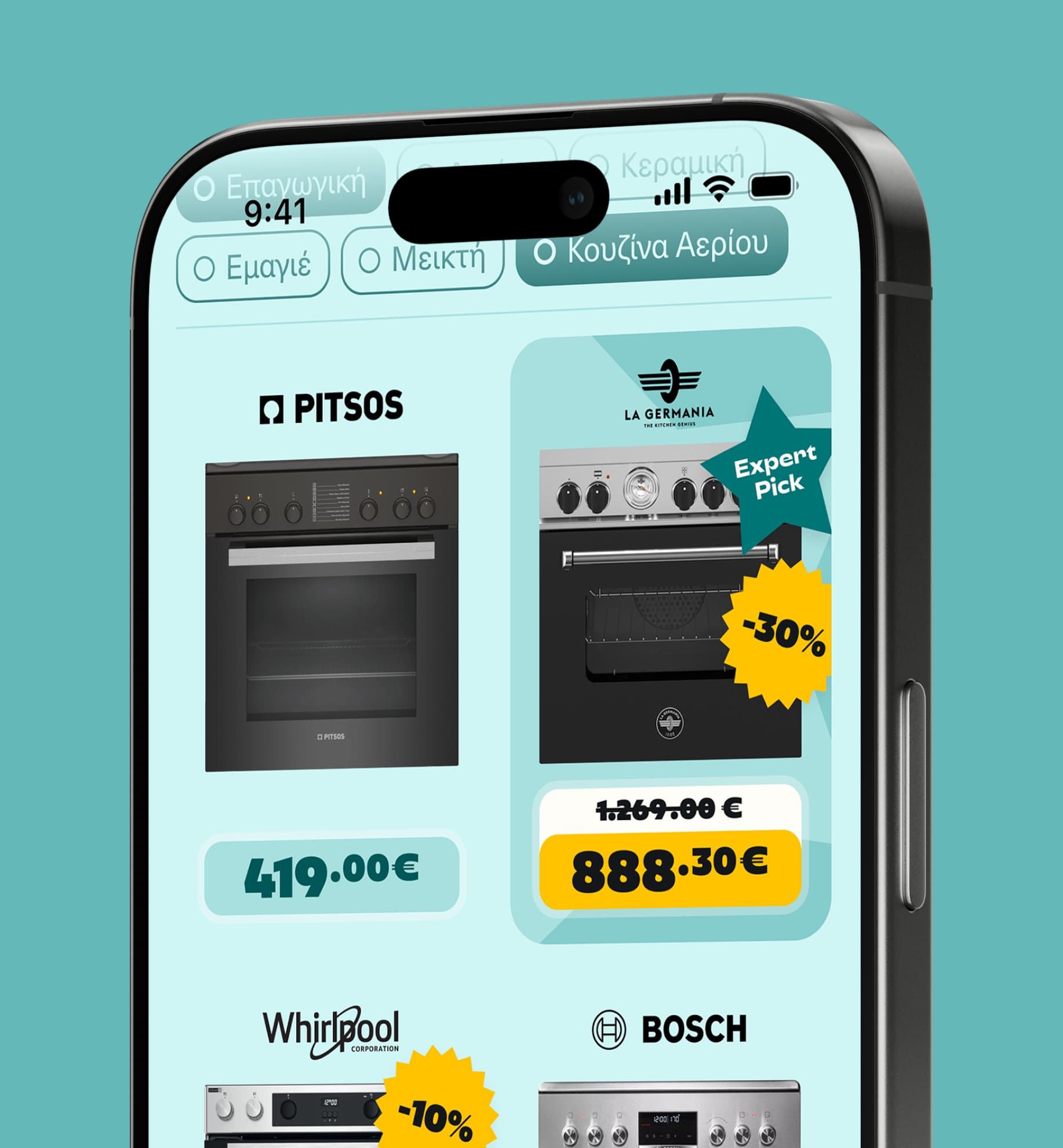
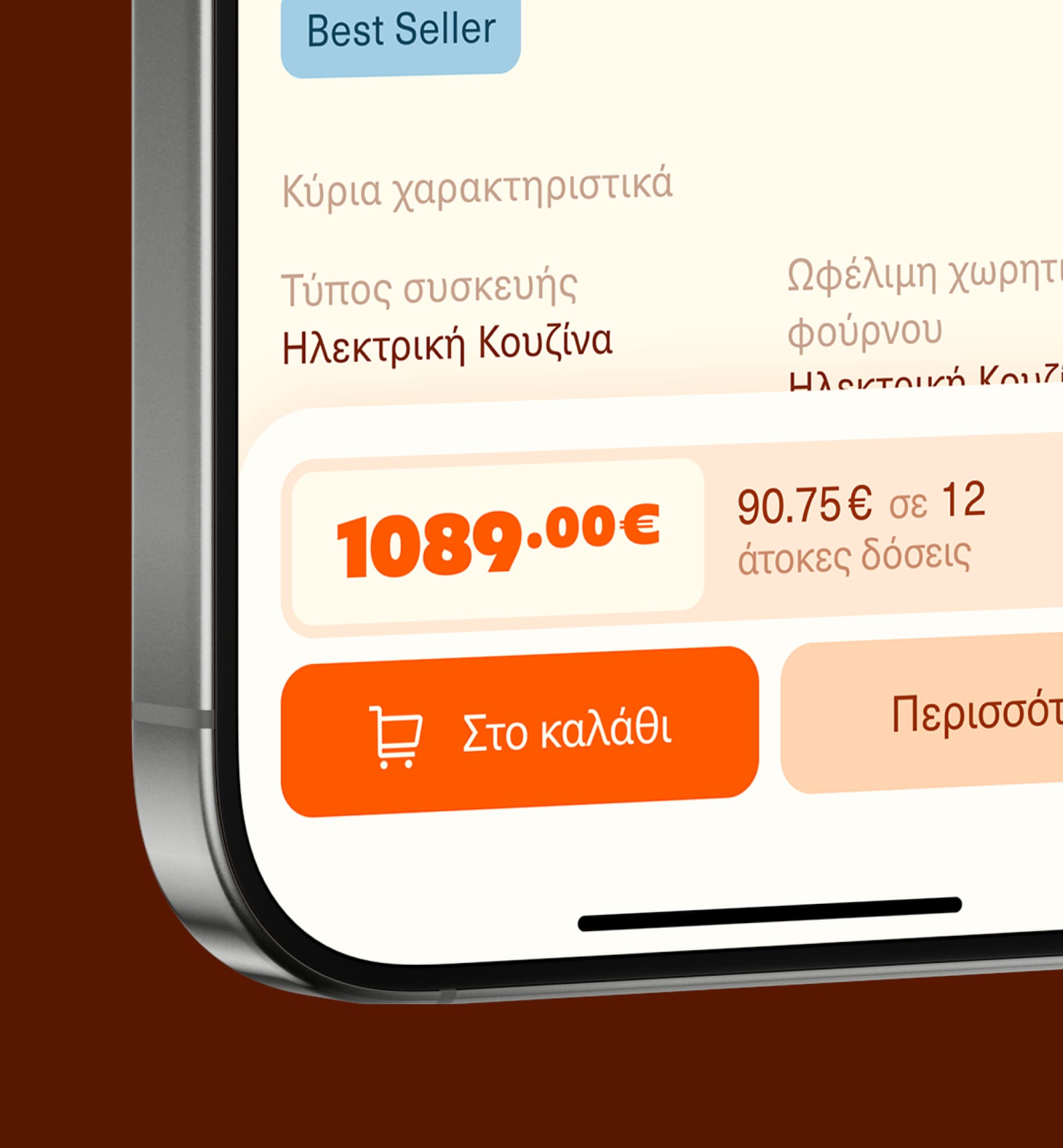
Tactical Communication System
During the brand activation phase, we developed a series of digital applications for tactical communications, dictating the need for creating a comprehensive and adjustable pricing tag system that would allow for consistent and easy application of diverse pricing information in various sizes, scales and formats.
For more insights into tactical-focused communication materials, visit Tactical tab at top of the Case Study page.