Explore the full case study ↓
Reconceptualizing legacy & trust withEthniki Insurance
The first insurance company in Greece, founded in 1891 and leading the national insurance landscape ever since. In 2023, Ethniki Insurance decided on the need for a new website, aspiring to modernize and re-introduce its human-centered solutions and long-established assets to wider and younger audiences. Pivoting the project scope by highlighting the value of a holistic visual and verbal refactoring, 5 months later we presented a radically new solution; a comprehensive brand identity that would address our times, align with the company’s history, and ultimately reflect its core values of trust and integrity with simplicity and transparency.
Elevating continuity to the strongest trust asset
Logotype Redesign
What makes people choose one insurance company over another?
That was the simple yet definitive question we addressed at the kick-off of our design process for Ethniki Insurance’s new identity.
All the reasons we listed circled back to a single one; trustworthiness - the ability of an organization to inspire confidence and certitude with stability and transparency. Diving deeper into the qualities that bring trust forward, we found legacy - an entity’s enduring experience and impactful presence at critical moments through times.
That’s where we marked Ethniki Insurance’s major advantage that defines its unique positioning. Proven by its 100-year history and impactful support during some of the country’s most critical moments, Ethniki Insurance’s legacy as its strongest asset was indisputable.
At that point, we traced back Ethniki Insurance’s history and searched among its most fundamental elements. Our objective was to find the ones with the greatest and most meaningful potential to be elevated into solid, contemporary and dynamic assets for a new yet cohesive communication in both physical and digital applications.
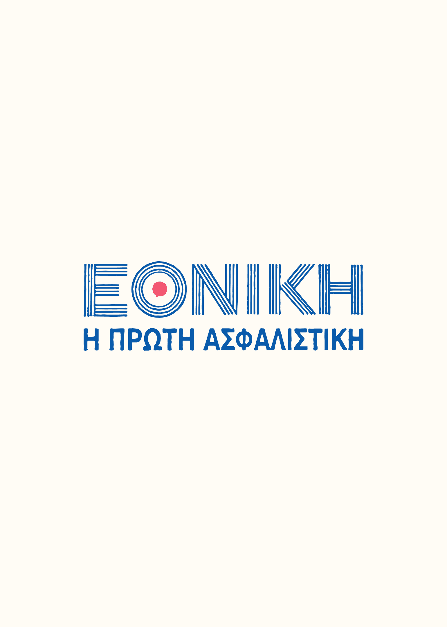
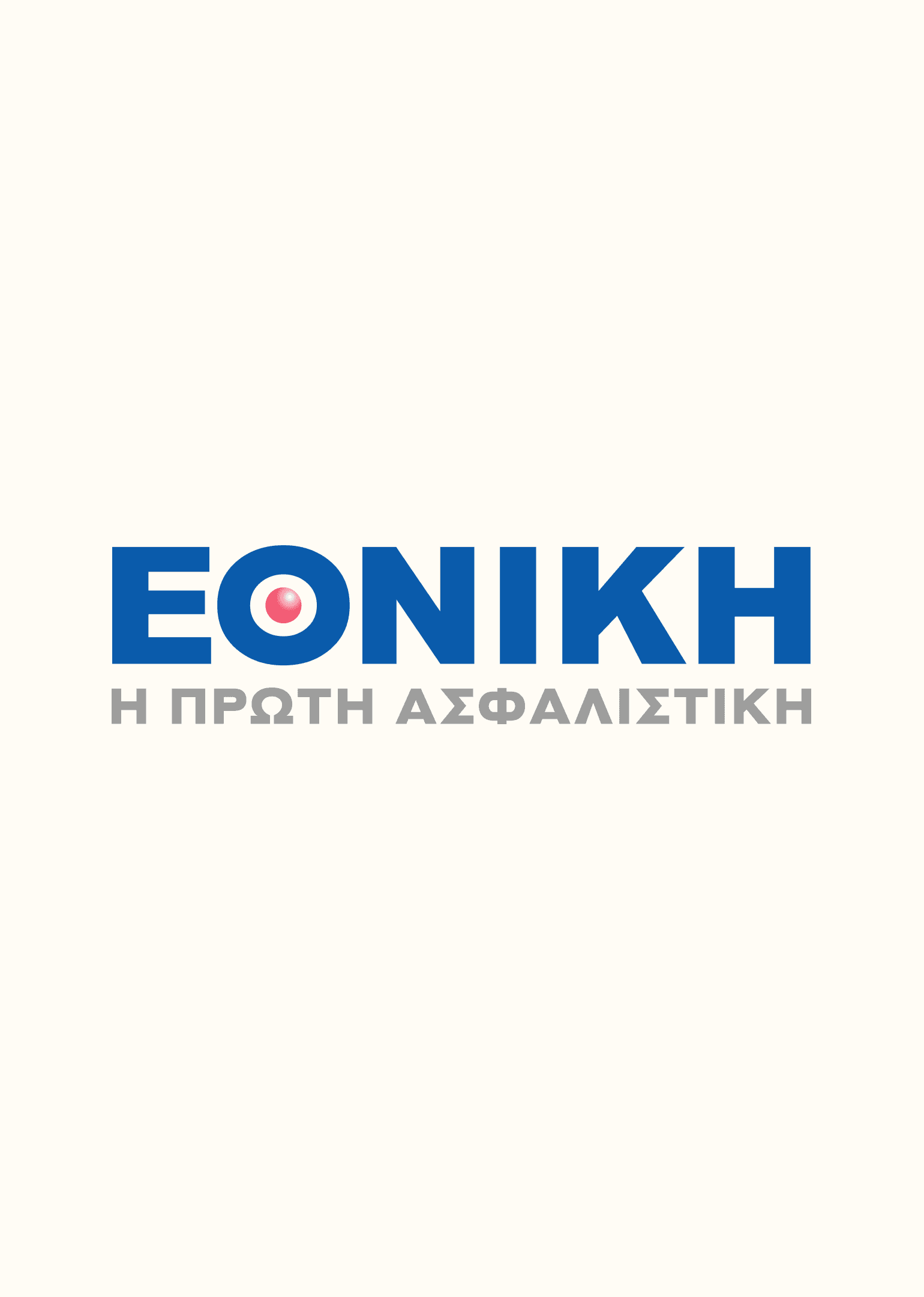
Flipping through archive corporate documents, we came across our starting point; one of the oldest and most emblematic logotypes in the history of Ethniki Insurance’s brand.
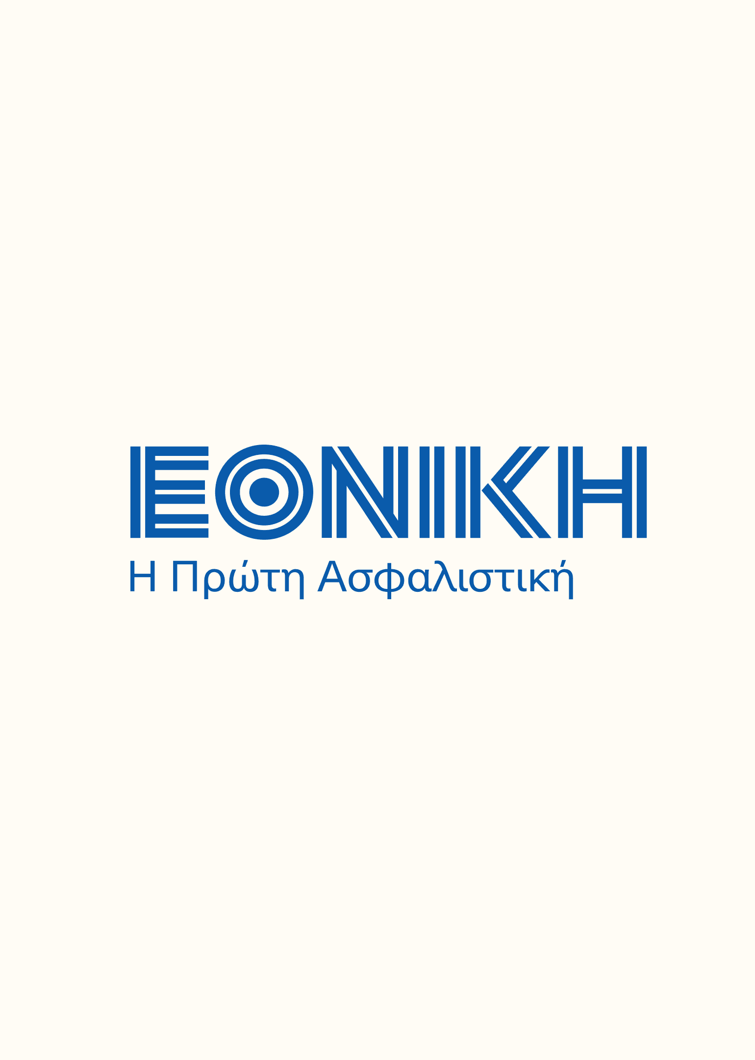
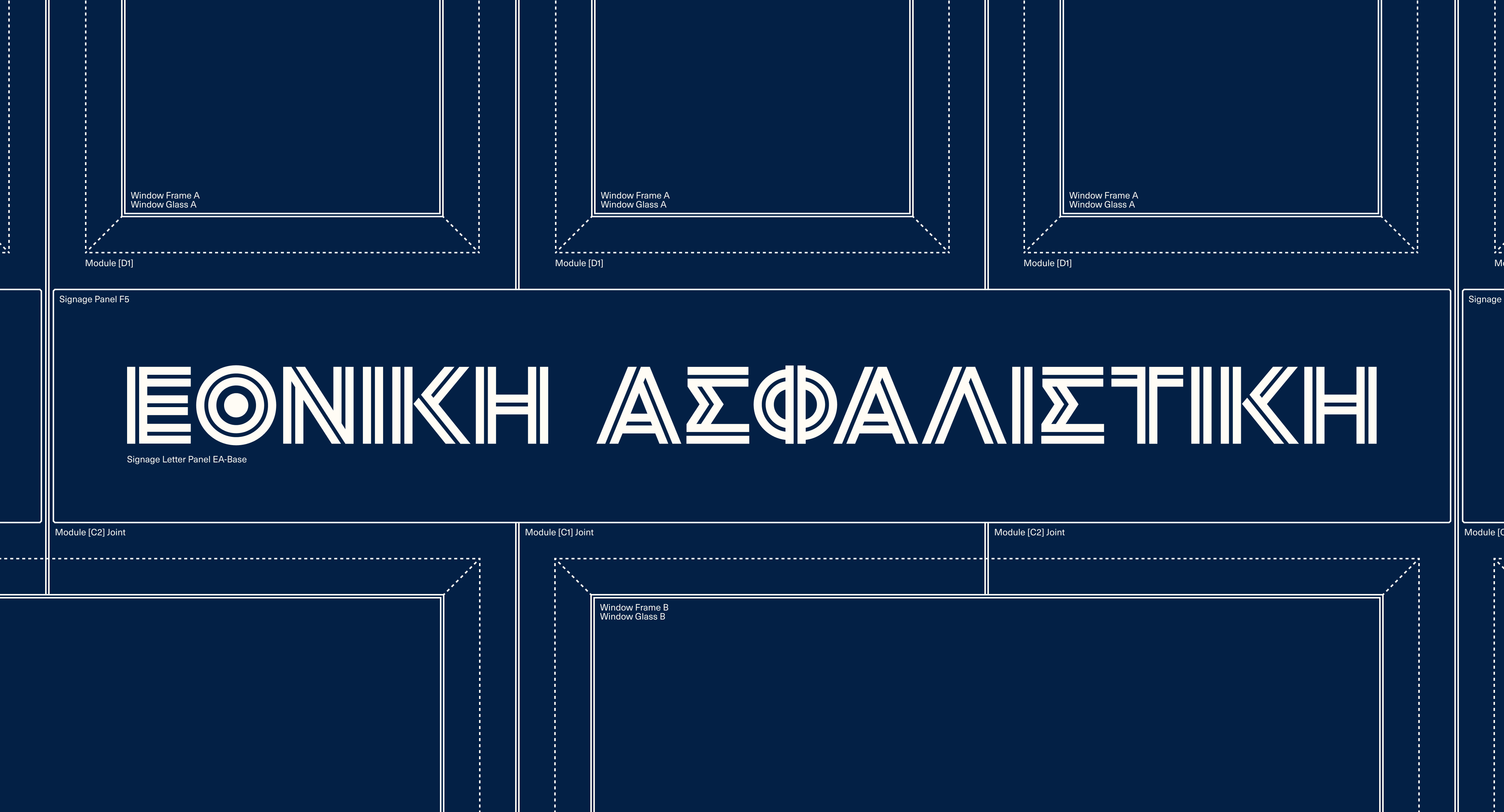
After digitization and a thorough study of its qualities and structure, we proceeded to the construction of a new logotype that makes for a simplified, contemporary and digital-friendly version that ensures continuity and recognizability with respect for the company’s legacy.
The result was a completely fresh take on Ethniki Insurance’s main and most characteristic visual element, embodying the company’s evolution and considerate transition towards simpler processes and cutting-edge solutions, while remaining loyal to its core values; human-centricity, integrity, and innovation.
HØLY did an impressive job making the best out of this colossal name of Ethniki Insurance and helping us take it to the next day.
While the double-stripe composition becomes Ethniki Insurance’s new main logotype, a series of existing and upcoming sub-brands dictated the need for the creation of a logotype system that could represent each entity in an equally wholesome, consistent and recognizable way while meeting functionality and accessibility standards across applications.
In the framework of this system, Ethniki signature maintains the double-stripe structure, ensuring continuity with the main logotype, while sub-brand alternations adopt the main typeface, allowing for flexibility and functionality no matter the occasion.
Symbol Design
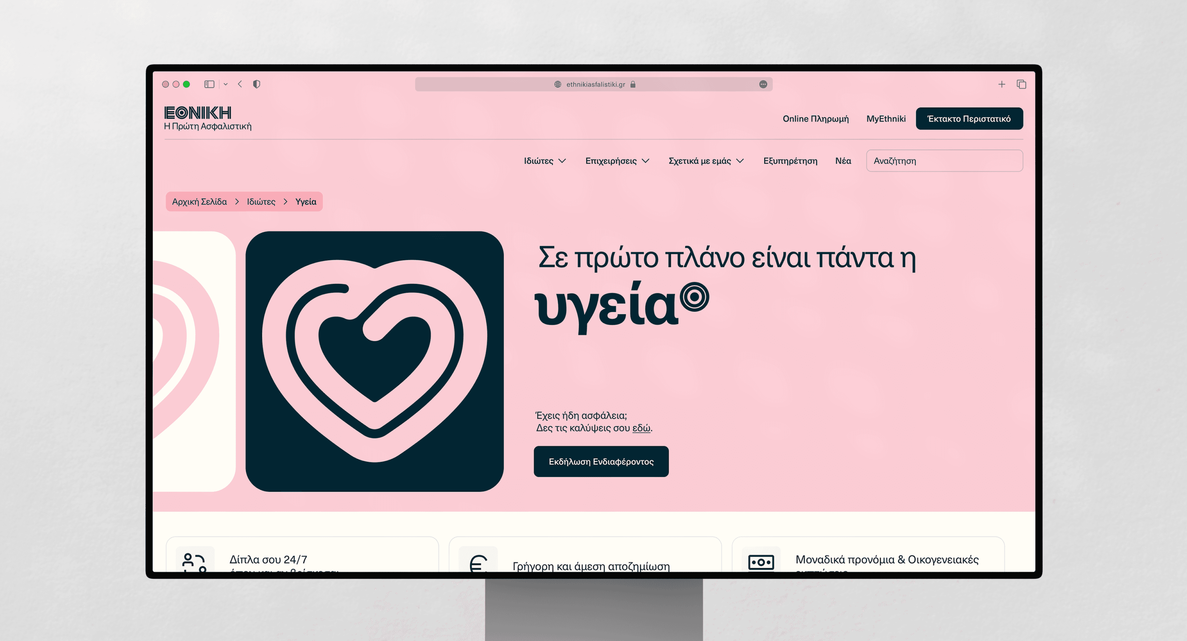
Digging into the qualities of Ethniki Insurance’s most widely recognizable elements, a second challenge for us was to preserve the brand’s long-established symbol, deriving from the letter θ (“theta”) of the brand’s Greek name, and reposition it in a functional and meaningful way.
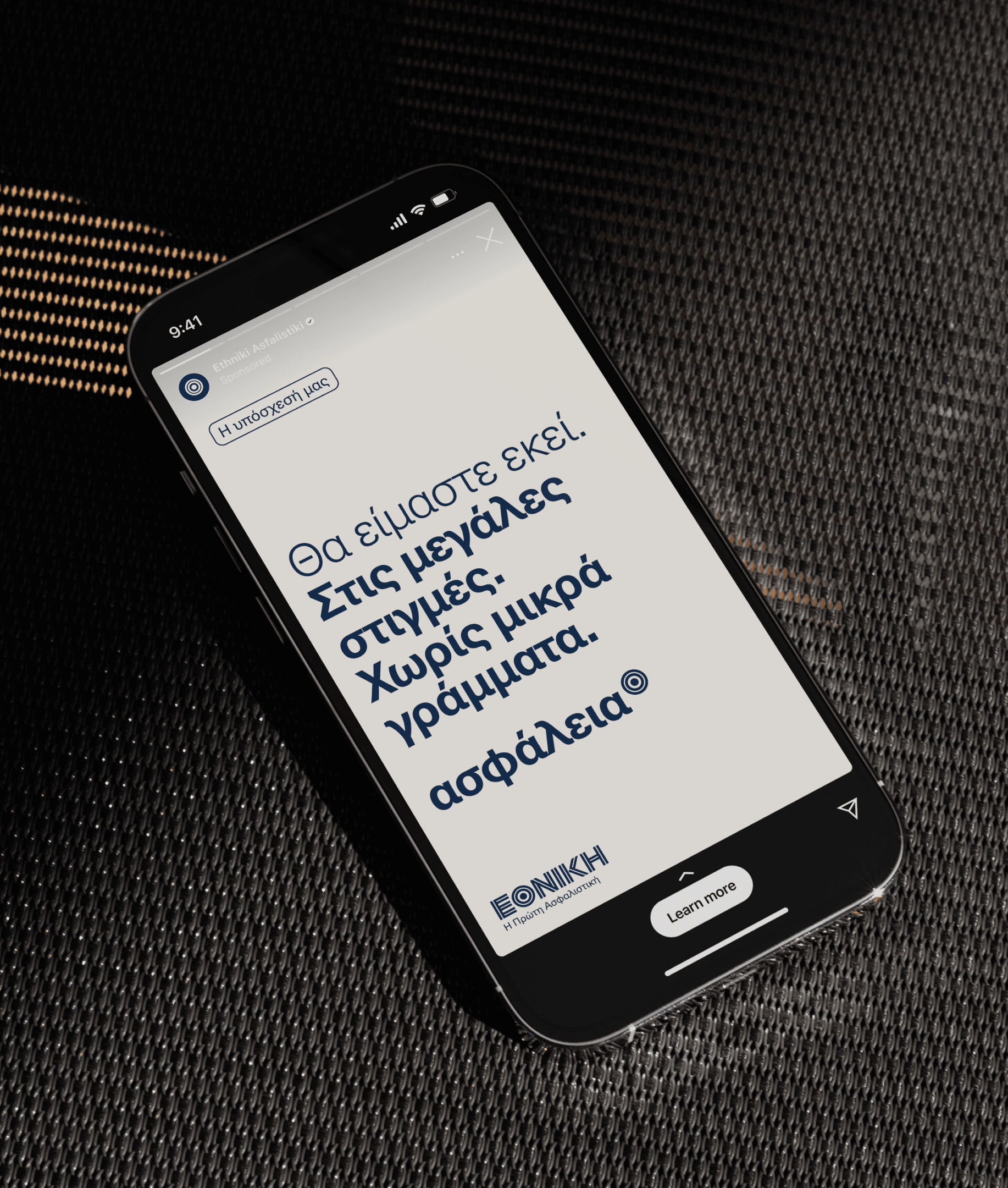
Previously unsystematic and merely decorative, Ethniki Insurance’s symbol now gets featured as a constructive brand element, working both as a stand-alone symbol and as content’s supporting element. More specifically about the latter case, Ethniki’s re-invented symbol appears at the superscript position to practically stamp on everyday yet brand-sensitive keywords, and associatively familiarize audiences with the deeper values the brand represents in a more human-centered but also confident and reassuring way.
Product Branding
Ethniki Insurance’s rebranding was much more than highlighting legacy and building a strong concept that could enable more effective brand awareness. It was also about communicating insurance products as solutions and creating a consistent system that could effectively address all the performing sectors in a consistent, cohesive and recognizable way.
By the time we had landed on the structure of the new main logotype, we revisited the details that could work as foundations of a secondary language, appropriate for product-focused yet customer-centric communications.
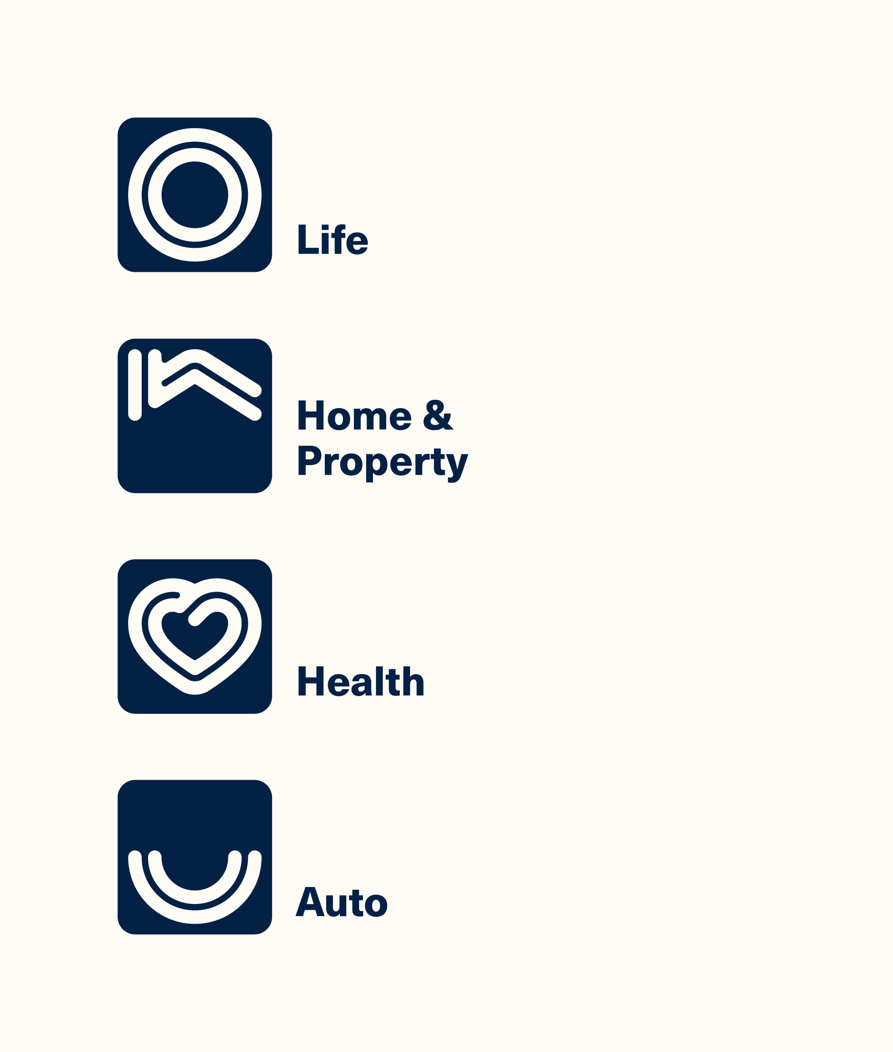
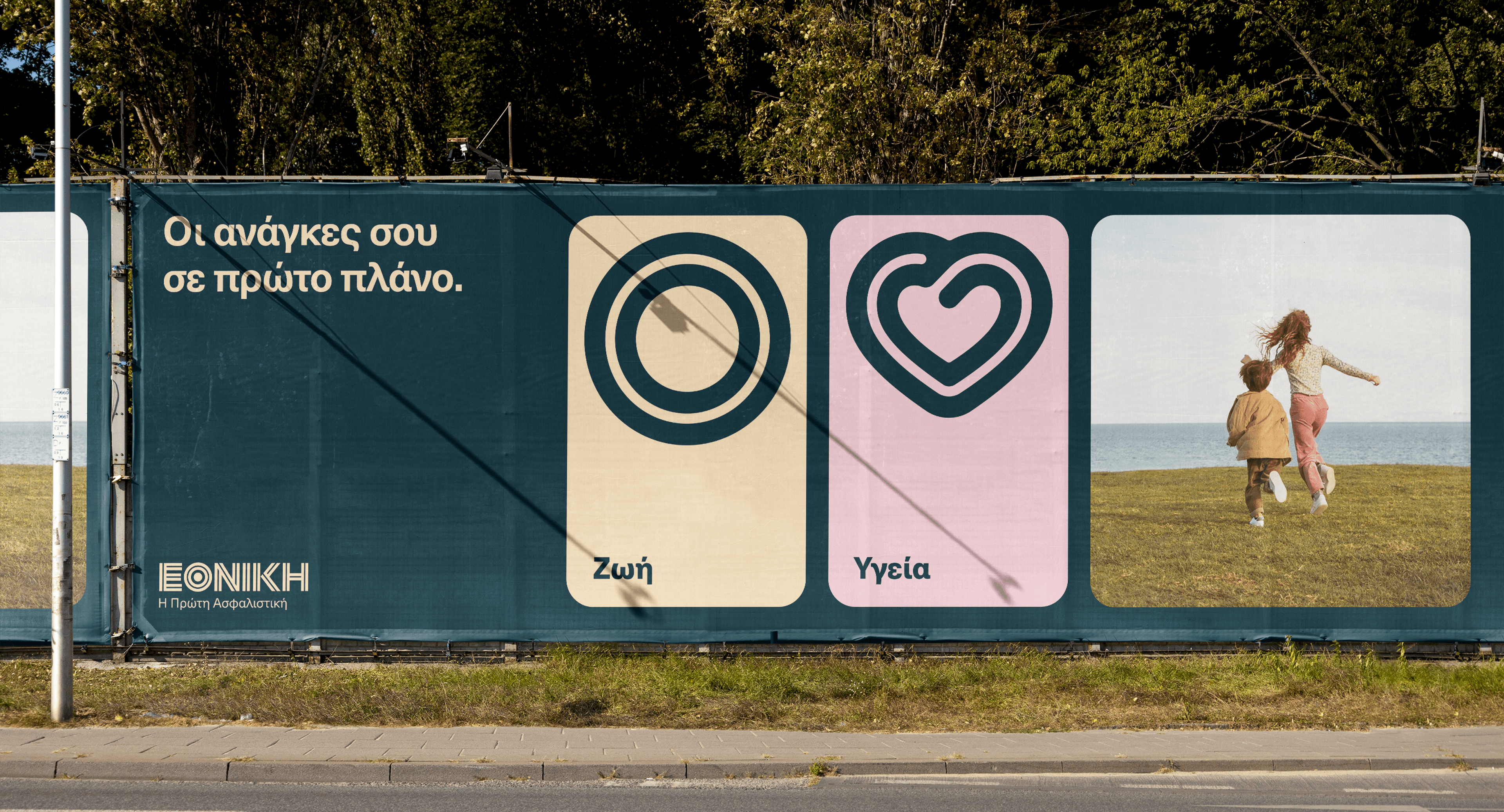
To create a comprehensive icons system for Ethniki Insurance’s products, we maintained the logotype’s stripes for continuity and consistency, and applied rounded corners and smoother connections for familiarity, friendliness and approachability.
The final result comprises a complete system of icons to cover all individual-focused and business-oriented product categories, while also reflecting the care, the protection and the complete coverage offered through the different available plans.
You are rarely given the chance to radically redesign the identity of such a historic and long-established organization. With a 123-year history and over 1 million customers, Ethniki Insurance finally has an identity that resonates; a contemporary, flexible and accessible visual system, that was warmly received by the company’s core, as well as partners and customers.
Brand Assets
To fortify Ethniki Insurance’s identity in all aspects, our design process moved forward with defining the complementary assets that would govern the company’s presence across physical and digital applications.
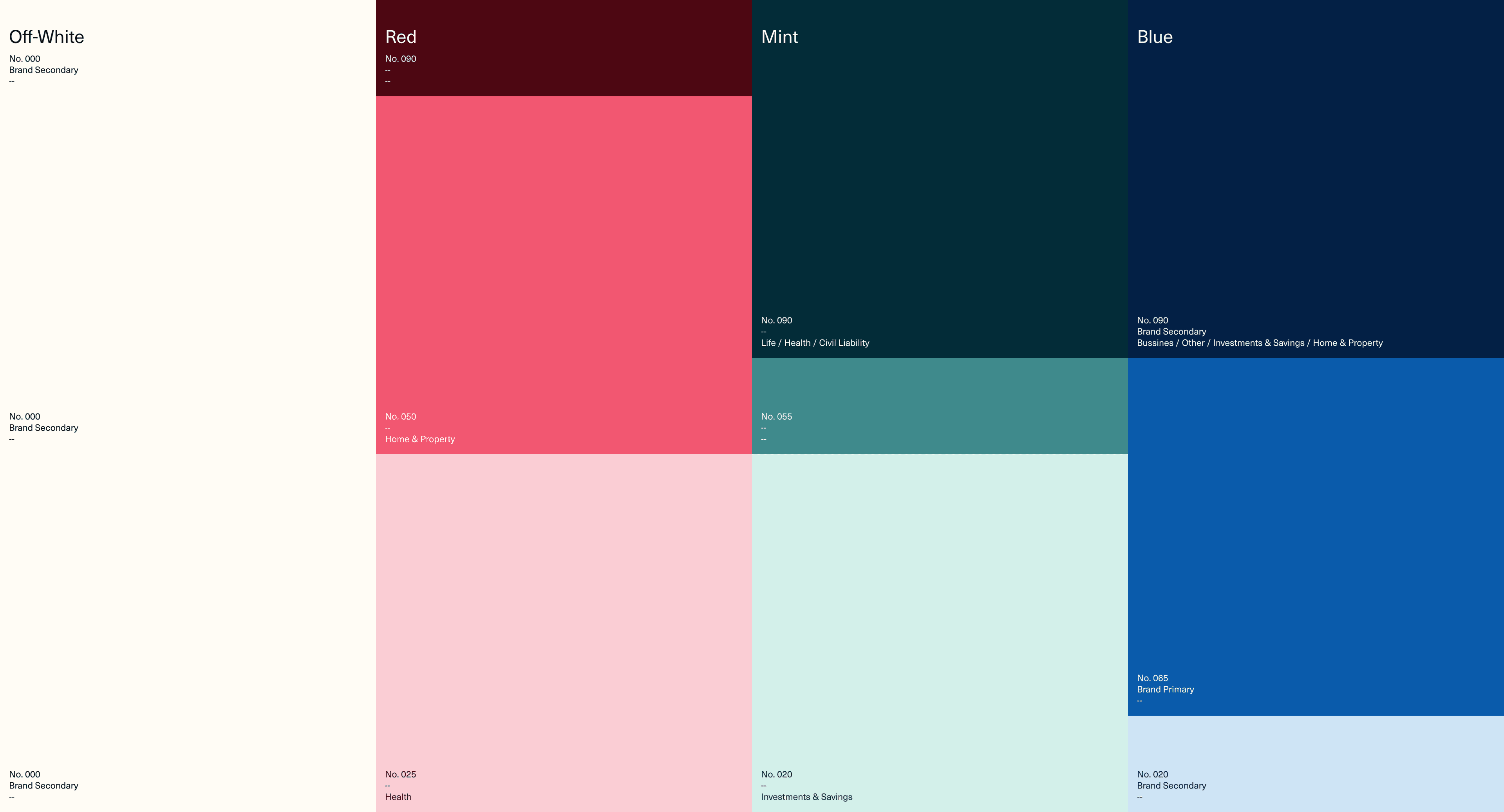
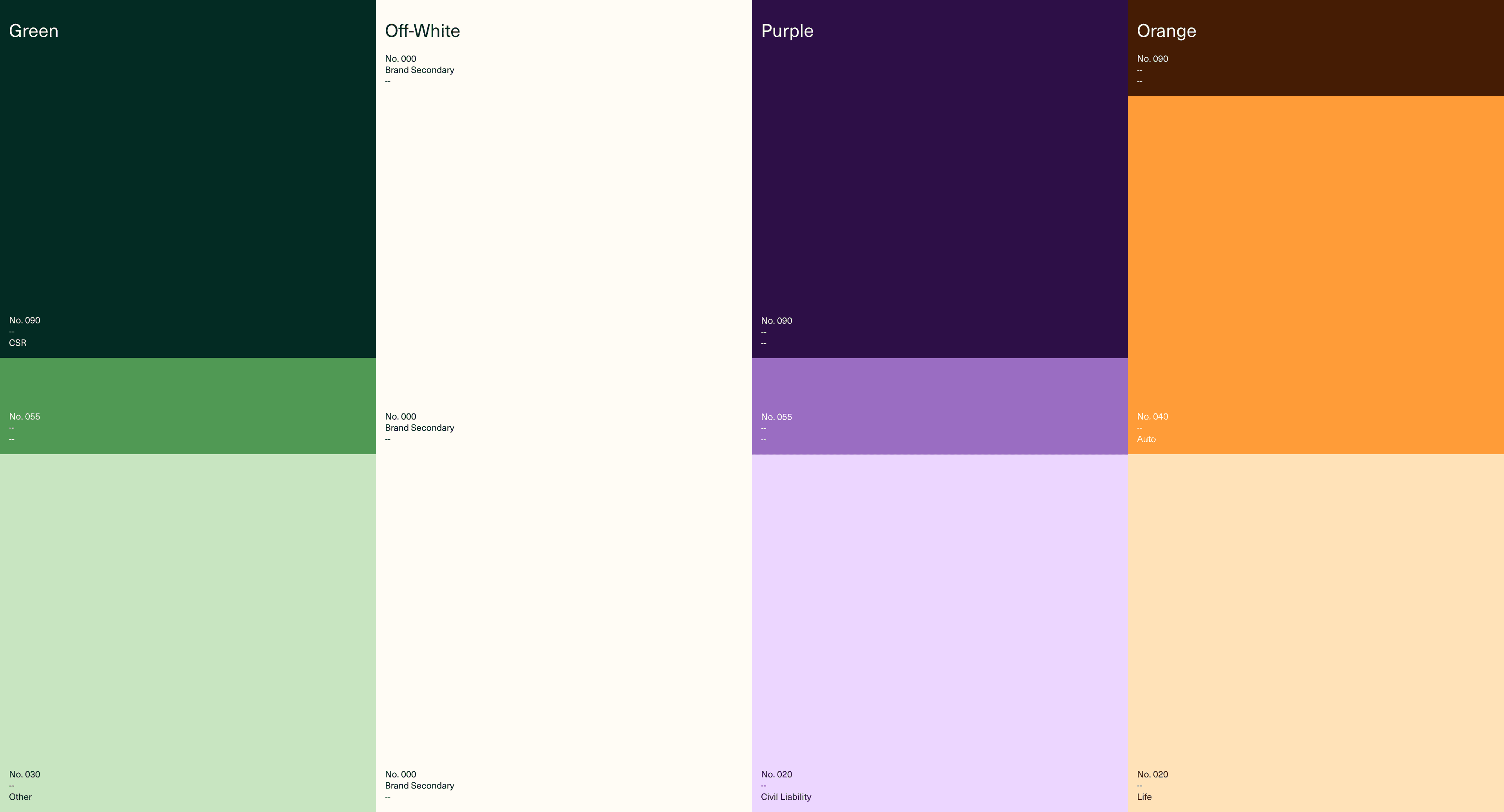
To meet the company’s goal of achieving a contemporary, agile and more youthful positioning in the insurance industry, we created a wide and vibrant color system, including both defined color sets for consistent product branding and suggested combinations for flexibility and diversity in several brand communications.
On a typographical level, the selection of Neue Haas Unica enables clean communication, thanks to the typeface’s classic, stable and humanistic character that promotes human-centric and clear messaging while ensuring legibility for both short headings and longer paragraph texts.
At the same time, the creation of all brand assets on a well-structured grid allows not only for proper hierarchy that facilitates readability but also for consistency and clarity that guarantee recognizability and effective communication.
Brand Implementation
With the new logotype system and the wide brand assets library at hand, our partnership with Ethniki Insurance moved forward with the brand activation, a streamlined and thoroughly orchestrated process that guarantees a smooth transition to new communication practices and proper application of the new style guides.
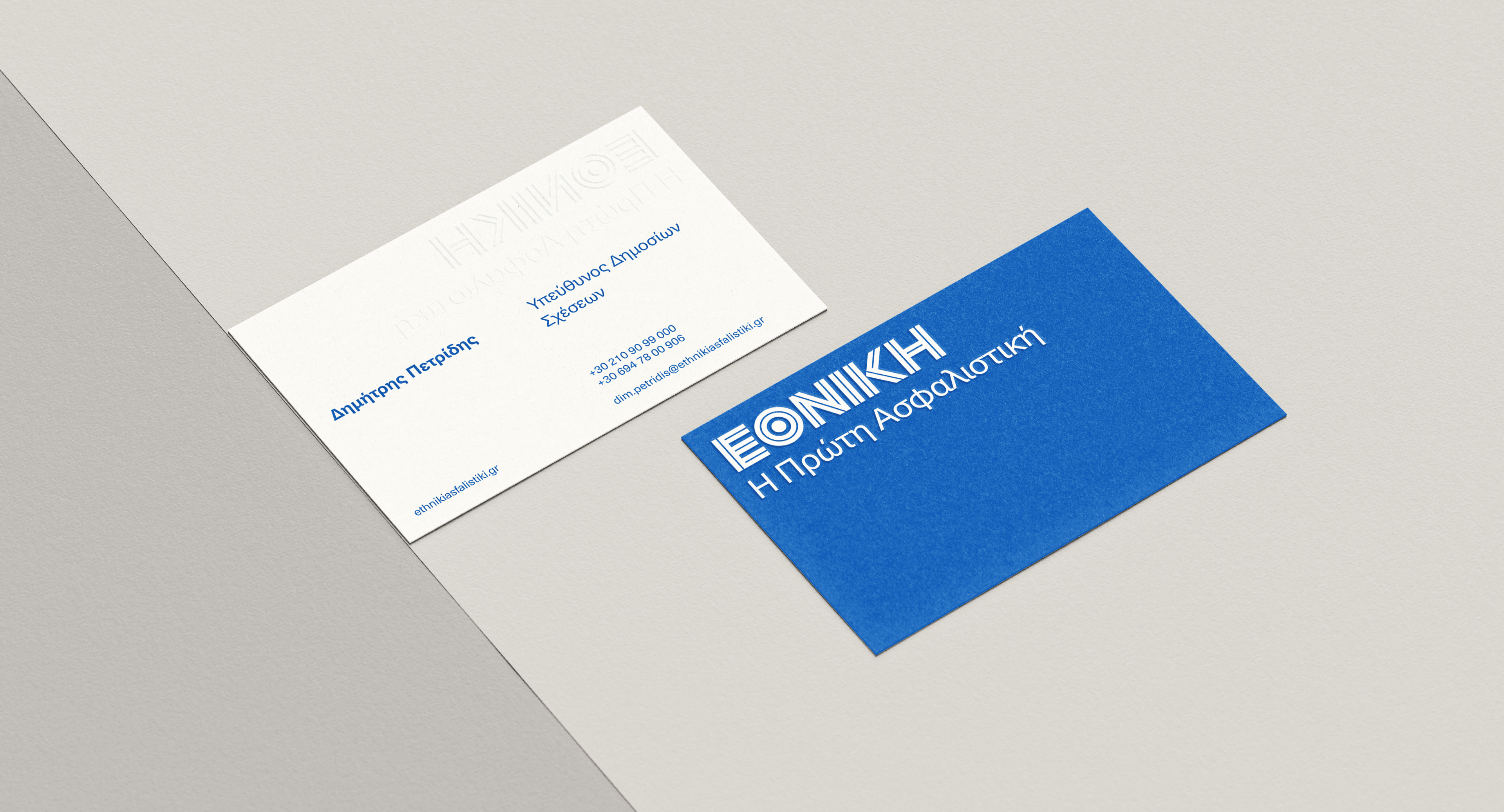
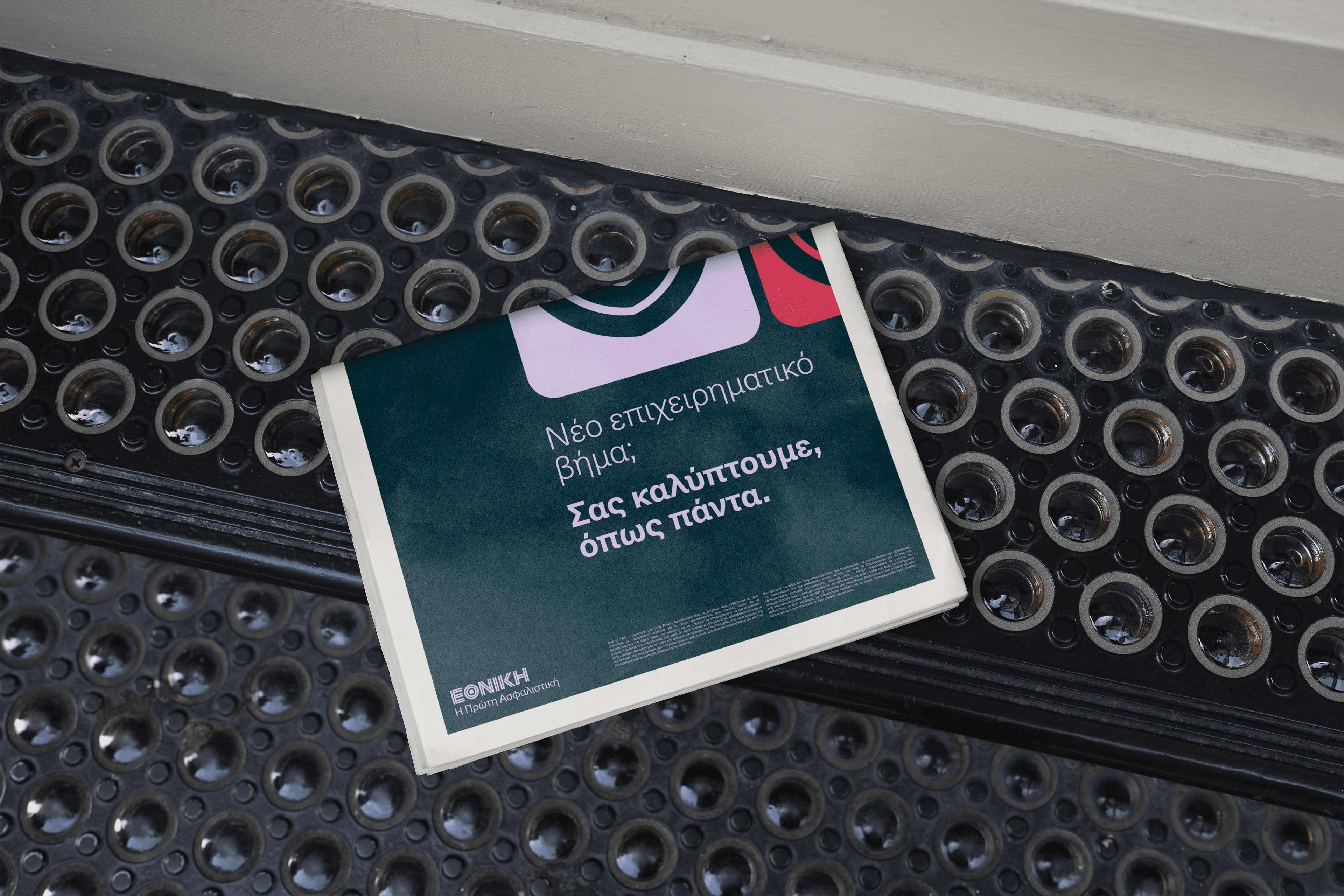
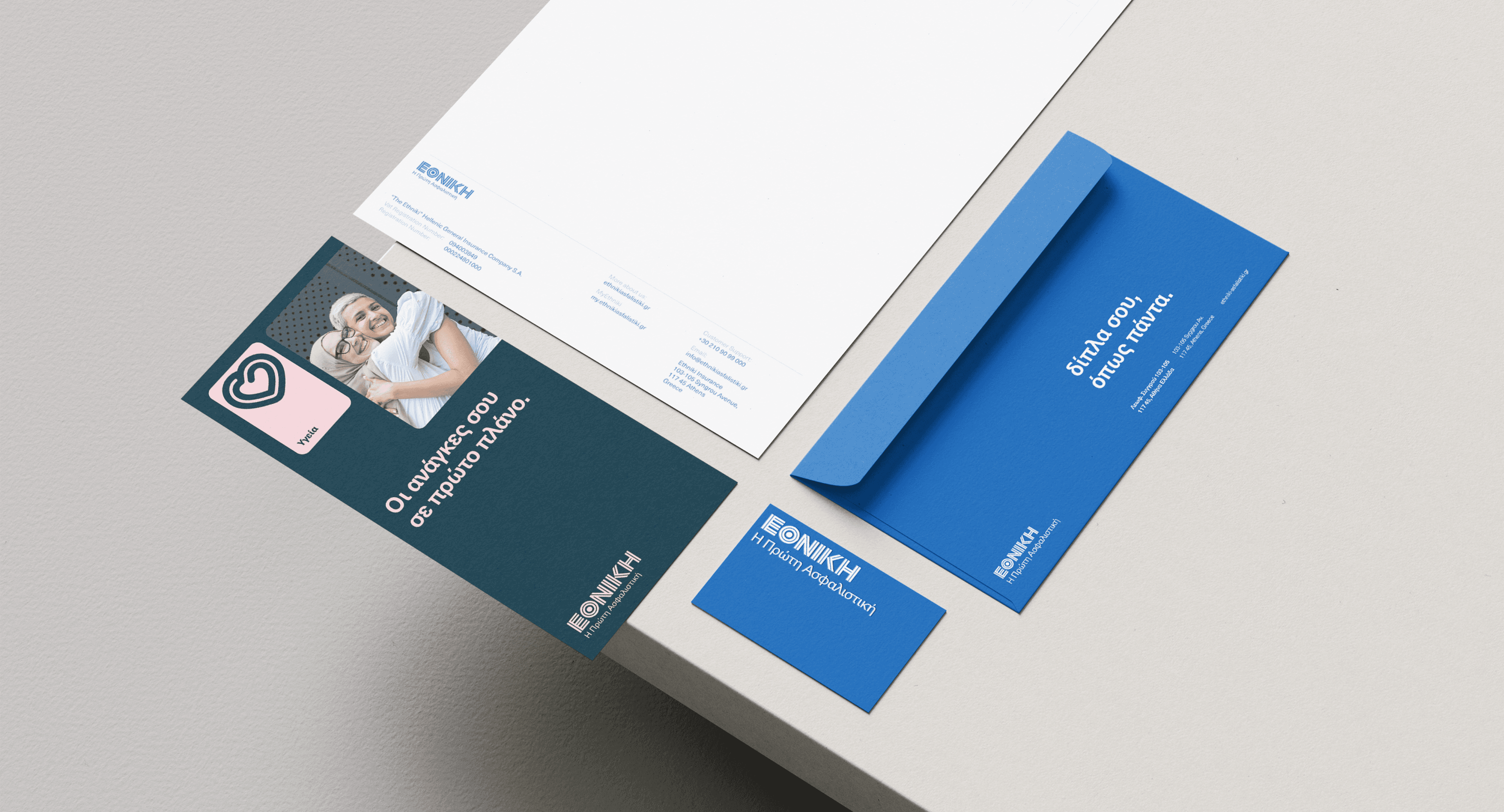
For its first phase, brand activation included the creation of a series of applications, such as stationery, corporate documents, presentation and social media post templates, whose main goal was to facilitate the easiest possible adaptation of content as per the company’s needs for internal, partnership-oriented, or customer-focused communications.
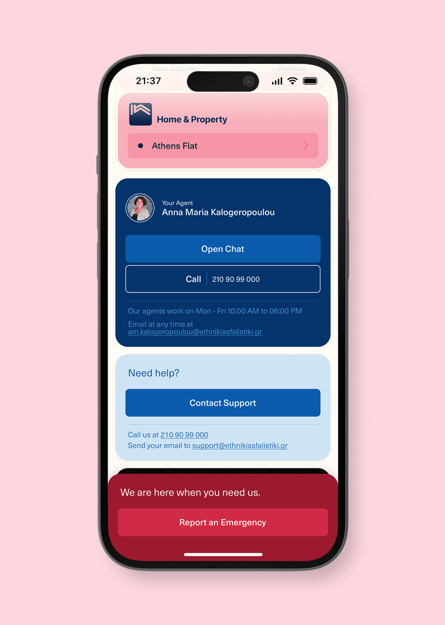
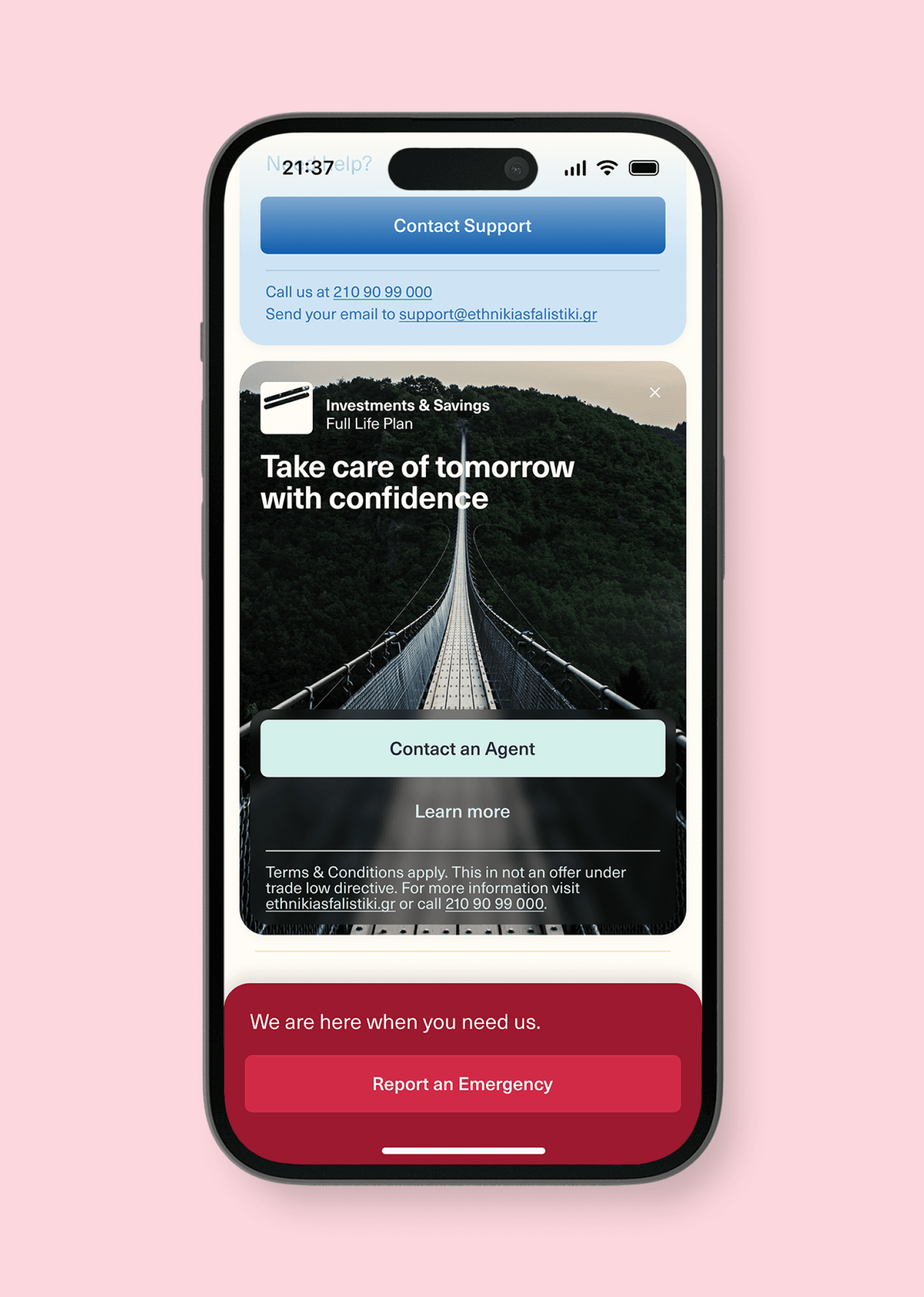
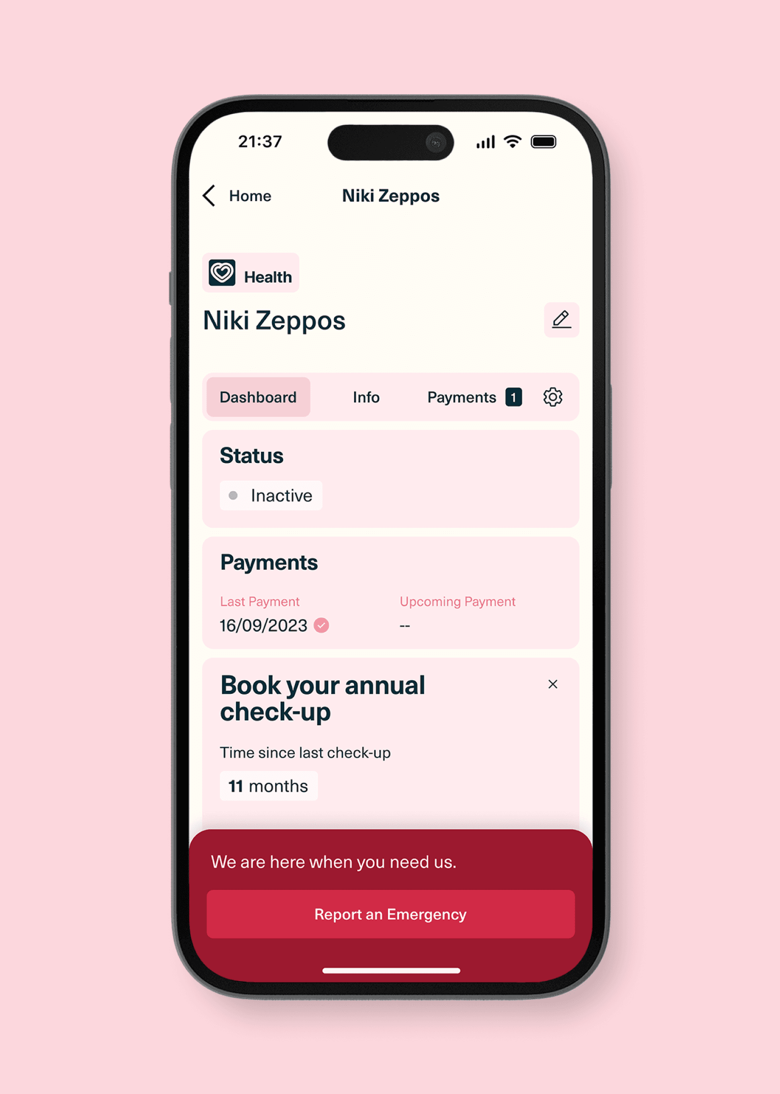
A major and crucial part of our partnership with Ethniki Insurance regarded the creation of a radically new web presence, requiring our closest collaboration with the company’s Marketing, Sectoral and IT teams. The main objective was not just to extend and apply the identity’s principles to the digital world, but to build a user-friendly and accessible web experience that meets high-performance standards and allows for cost-effective implementation and scalability.
Read more about Ethniki Insurance’s website building on the UI/UX tab.
