Explore the full case study ↓
Reconceptualizing legacy & trust with Ethniki Insurance
The first insurance company in Greece, founded in 1891 and leading the national insurance landscape ever since. In 2023, Ethniki Insurance decided on the need for a new website, aspiring to modernize and re-introduce its human-centered solutions and long-established assets to wider and younger audiences. Pivoting the project scope by highlighting the value of a holistic visual and verbal refactoring, 5 months later we presented a radically new solution; a comprehensive brand identity that would address our times, align with the company’s history, and ultimately reflect its core values of trust and integrity with simplicity and transparency.
Leveraging modularity and clarity for efficient user-first communication
The Objective
At the time of our assignment, the running version of the website’s aesthetics and functionality attributes dated back to almost the 00s. Taking on, our main objective was to create a user-first digital experience that is governed by contemporary design principles, providing solutions to users’ needs, enabling audiences’ education on insurance benefits, and building trust through easy navigation and straightforward user flows.
However, outdated stylistics, low performance, poor functionality and varied content, scattered through a great number of web pages, defined the existing website’s condition as quite demanding and the kick-off process as challenging.
Our Starting Point
Starting with wireframes design, our first step was to collect the totality of the content and categorize it according to the different content types in use. Our goal was to acquire all the input necessary to enable our exploration of an efficient solution for centralizing and purposefully re-organizing it; a solution that would not only respond to visitors’ needs but also serve the company’s internal needs for easy and cost-effective content management.
To define Ethniki Insurance’s internal needs, we conducted a sequence of collaborative workshops with the Marketing and Sectoral teams, along with in-person interviews with C-level executives. Our aim was to collect substantial input about the business, administrative and communication challenges we should take into consideration. In parallel, we internally proceeded to thorough research on industry practices and a series of hands-on exercises on critical user journey points, which would later significantly define our UX design decisions.
Those exercises of ours brought forward 3 distinctive UX decisions.
Firstly, we prioritized the insured users’ need to easily find important information in case of emergency. Thus, the most crucial and innovative for the market decision was to place the Emergency button on the menu and ensure its instant discoverability at moments of need for urgent support and coverage-related information.
Focused on our user-first approach, we differentiated the information an interested user needs from the information an already-insured user looks for. Our solution was a dual design for Product Pages’s wireframes, creating two separate user environments; a sales-oriented design that introduces the insurance product and an information-focused one that stands as a useful and easy-to-navigate resource for important documents and coverage processes.
As an additional feature, we supported the importance of a page that would be dedicated to educating audiences on how insurance works and what the benefits are.
All three 3 UX decisions shared the common objective of serving the brand’s main promise to bring the insurance industry closer to the people and establish its web presence as a helpful point of reference and support in case of need.
Wireframes Design
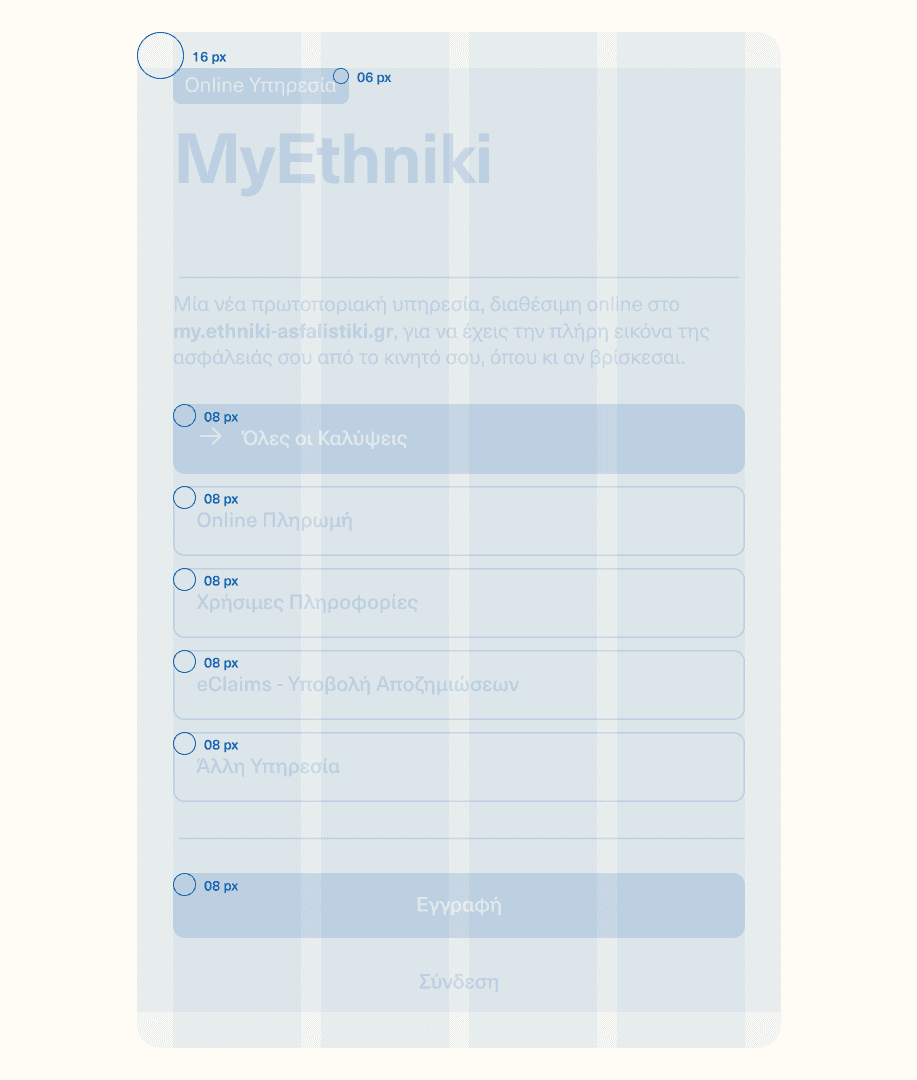
Overall, we proceeded to wireframes design based on a component-based approach, with clear information architecture and hierarchy allowing for consistent, flexible and fully adjustable content creation and management.
The modular nature of our solution not only facilitated and streamlined the initial UI/UX design process, but also granted internal Communication and Marketing teams autonomy and efficiency in modifying and instantly updating the website’s content covering ever-evolving needs.
With short-term training on CMS management, content management team members were post-delivery able to effortlessly add new page sections or create whole new pages, saving time and ensuring consistency no matter the need.
UI Styling
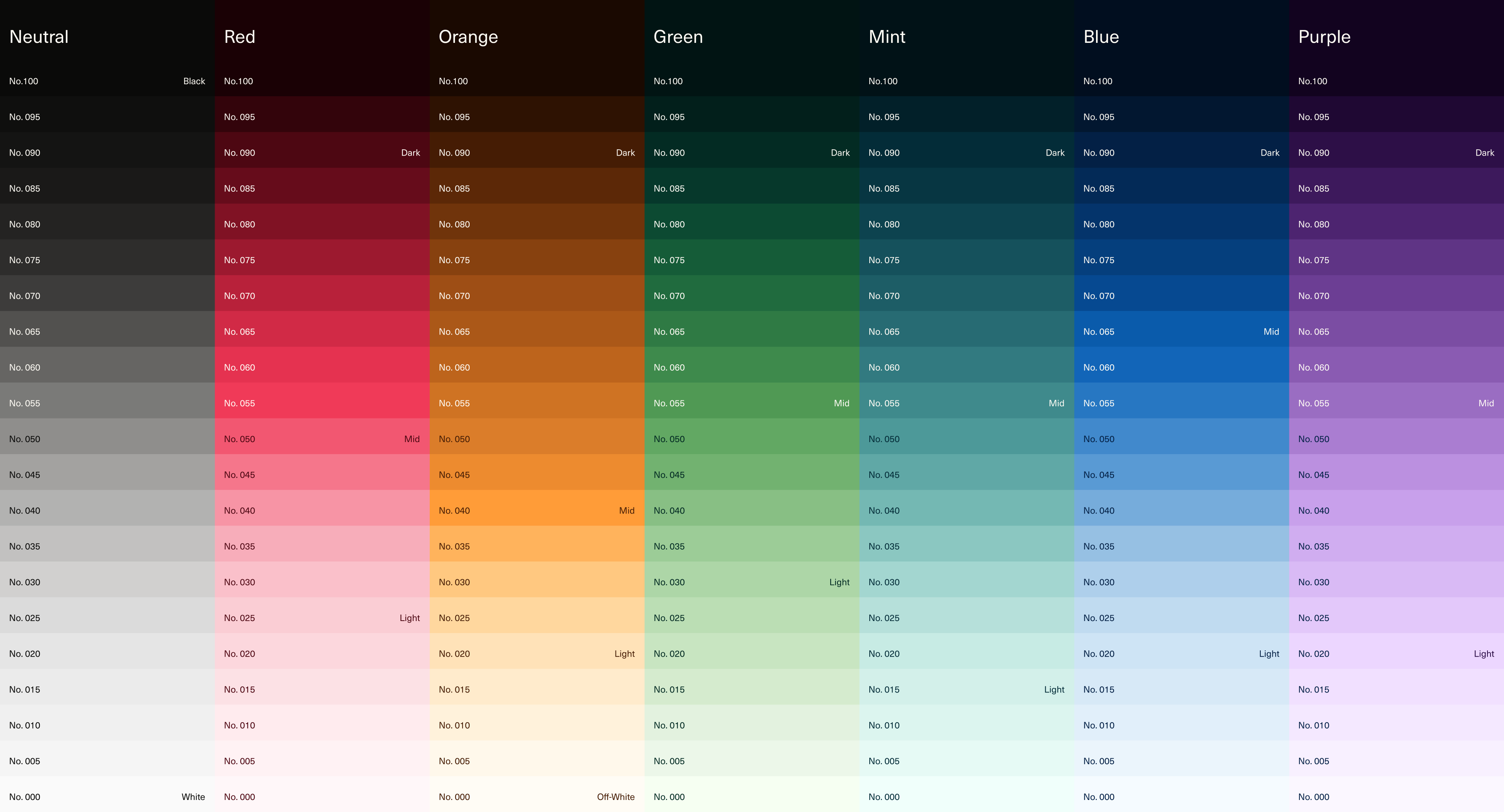
With all types of different components in place, we proceeded with UI styling, starting from the creation of a wide color palette that re-approached Ethniki Insurance’s characteristic blue color and introduced a new, digital-friendly color coding for all product categories.
The result was the composition of a detailed color library, setting primary brand colors and secondary shades that would allow for distinctive branding in both company and product pages, and ensure high-standard accessibility.
At the same time, composing a list of recommended text styles, we created a comprehensive pool for proper content hierarchy and legibility across cases, covering variable needs and facilitating users’ navigation through important messages and information.
On UI styling, a third distinctive element was the use of rounded corners, prominent in the visual identity’s UI-inspired aesthetic principles, reflecting the brand’s turn to digital-first communication with a more innovative and contemporary approach.
The Digital Experience
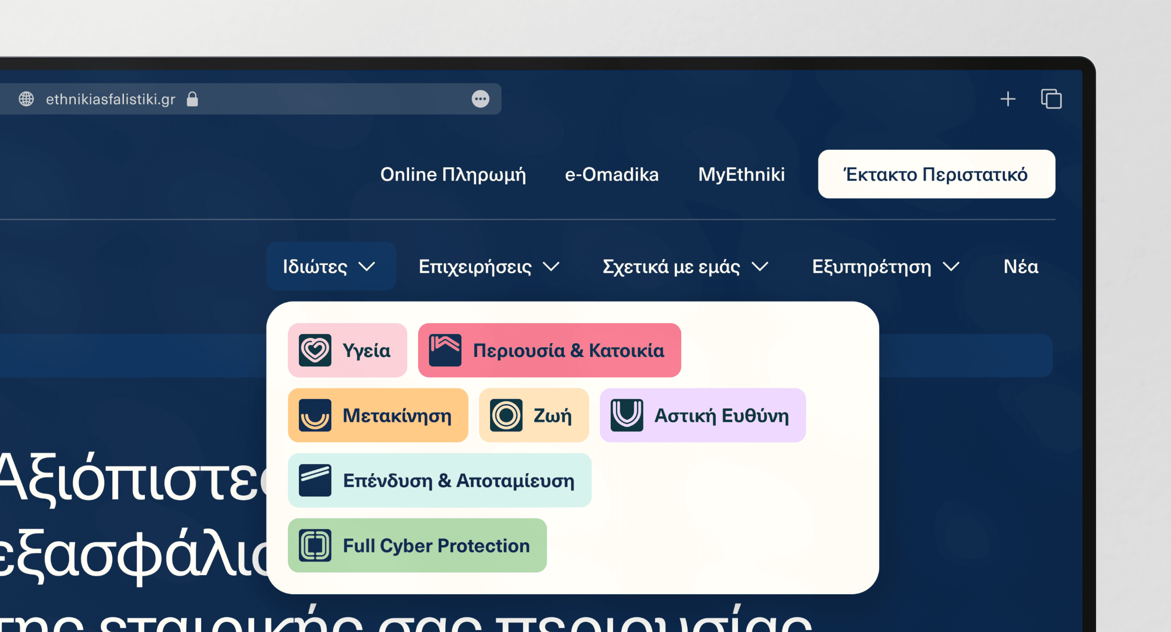
With a fully adaptable components library, a wide digital color palette, variable text styles and distinctive rounded UI elements at hand, the UI design process was fluently driven to the creation of a wholesome website experience with easy and accessible navigation through what’s important to the users.
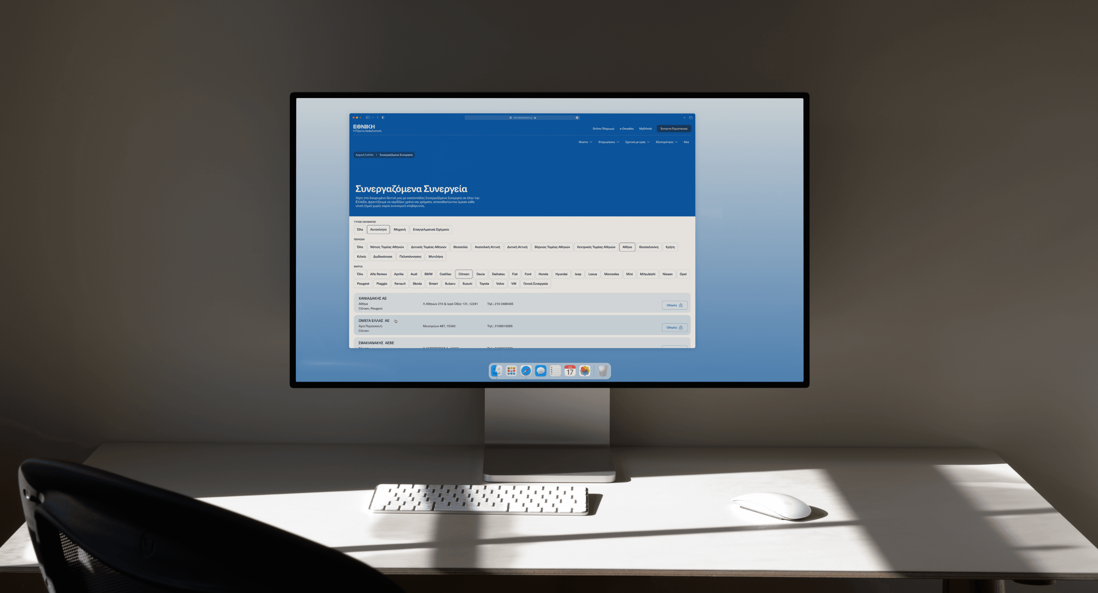
Upon landing on the Home page, the use of the brand’s symbol in favicon and product icons on the menu ensures brand continuity and clarity. At the same time, the top bar and menu composition allows for easy access to both the main website’s internal pages (B2C and B2B Product Pages, About, Blog), but also external platforms (Ethniki Agency Portal, e-Omadika Group Insurance Platform, MyEthniki Individual Insurance Profile), with the Emergency button as an always-on CTA, serving prompt and low-maintenance customers’ support at all times.
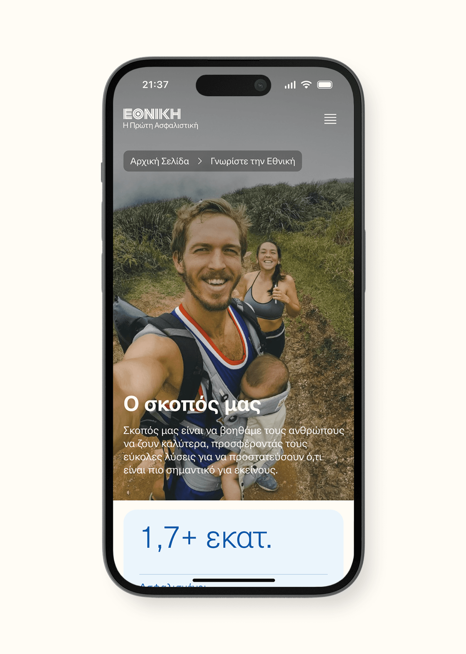
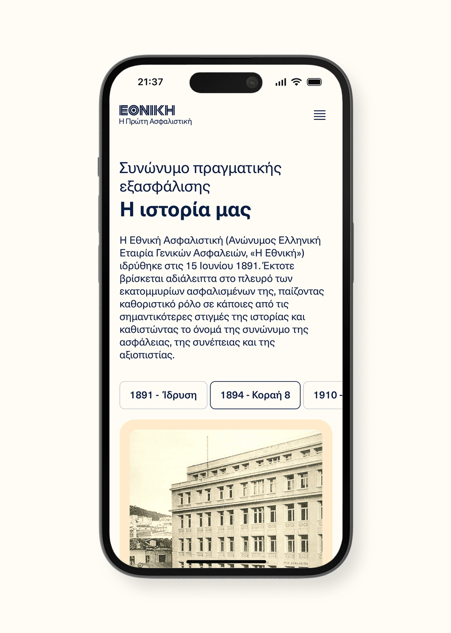
Another significant advantage of the website’s component-based design is that each component is autonomously responsive, guaranteeing the total website’s responsiveness and functionality across resolutions, no matter the amount or type of components used.
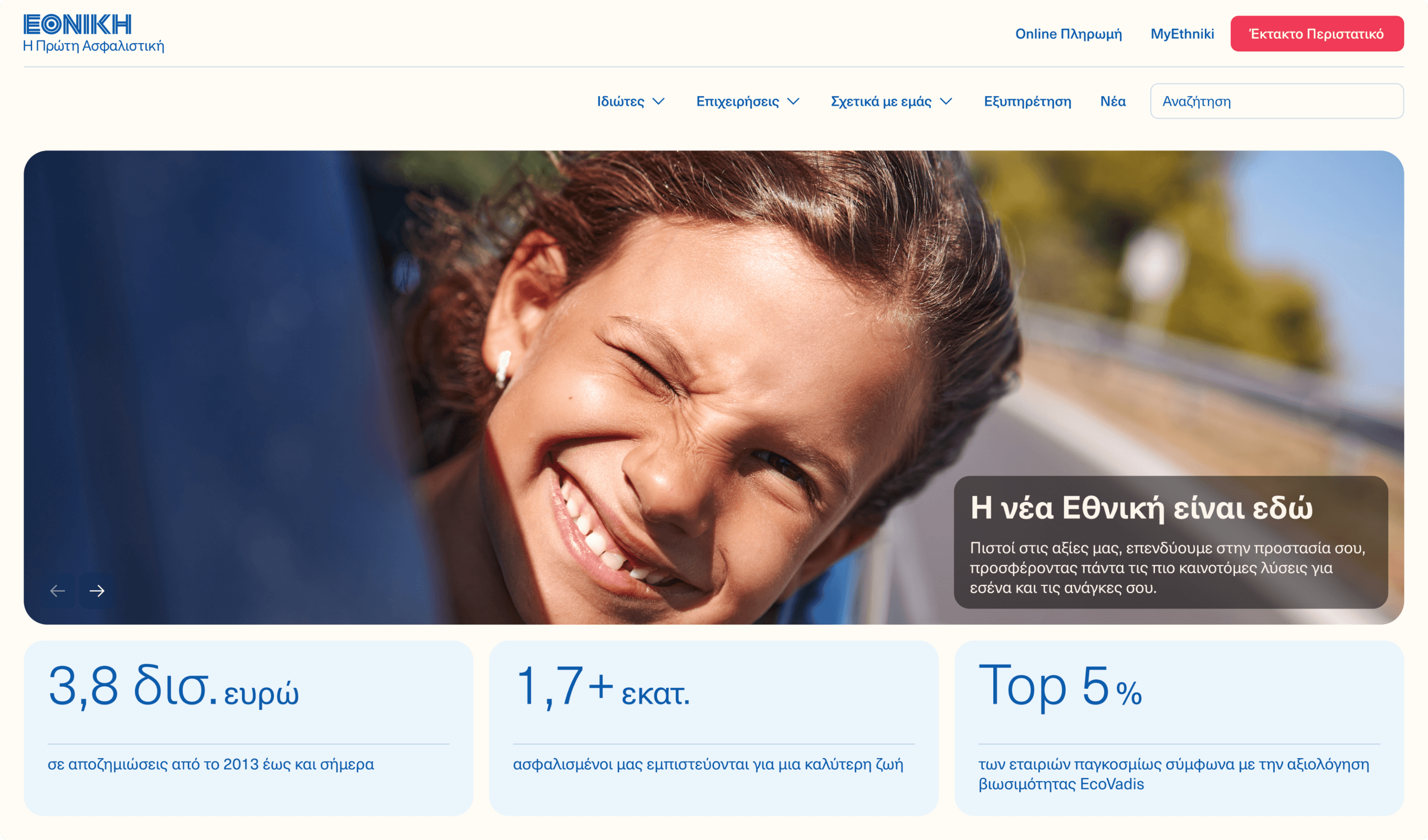
Especially for Products, we applied a distinctive color change between different pages, suggesting a non-lifestyle imagery - and thus innovative for the market - solution, that enhances Product branding and adds to the users’ experience in a transformative yet consistent way.
Governed by clear content hierarchy, modularity, contemporary design principles and resolution-agnostic functionality, Ethniki Insurance’s new website reflects the historic brand’s transition to a new era, where customers’ needs are heard, valued and supported through clear, consistent and accessible communication.
